User and market research for vocabulary app
Defining a problem | Competitive Analysis | Task Analysis | Usability Tests
Young professionals and students are often bombarded with new vocabulary at their work and studies. Studying new language and words could be an exciting process in the beginning, but as memorizing is time-consuming and a repetitive process, users need an application that they could use within seconds to save and memorize the new vocabulary later on.
Cram application is an application, where a user can save and upload their newly learnt vocabulary, categorize words based on their needs, memorize them through various games and access the dictionary to find new related words, topics and other user lists.
Tasks
User Research
User Interviews
Competitive Analysis (SWOT)
Task Analysis & User Flows
Usability Testing
Wireframing
Prototyping
Tools
Figma
Photoshop
Illustrator
Rotato
1. Problem
Professionals and students need an effective way to memorize a work and study related vocabulary. They also want to find similar words and phrases to already learnt vocabulary to improve their communication skills and widen their professional language.
Solution
Development of a comprehensive vocabulary app, which can store the learnt vocabulary, is connected to a dictionary and offers a variety of learning methods together with the organization of the vocabulary. We believe that we will address the needs of young professionals seeking an effective way to memorize work and study-related vocabulary while also improving their communication skills.
2. Market research & competitive analysis
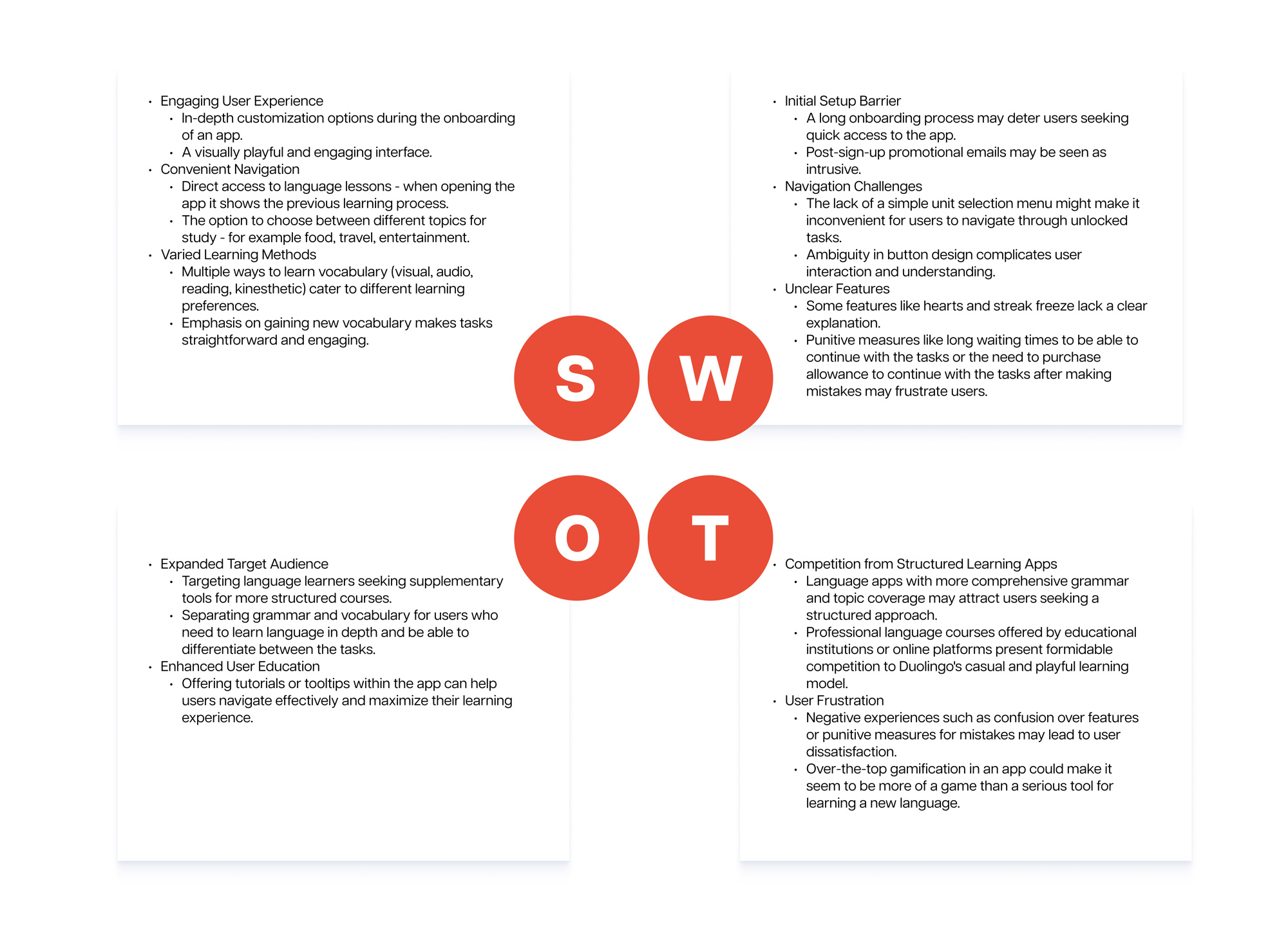
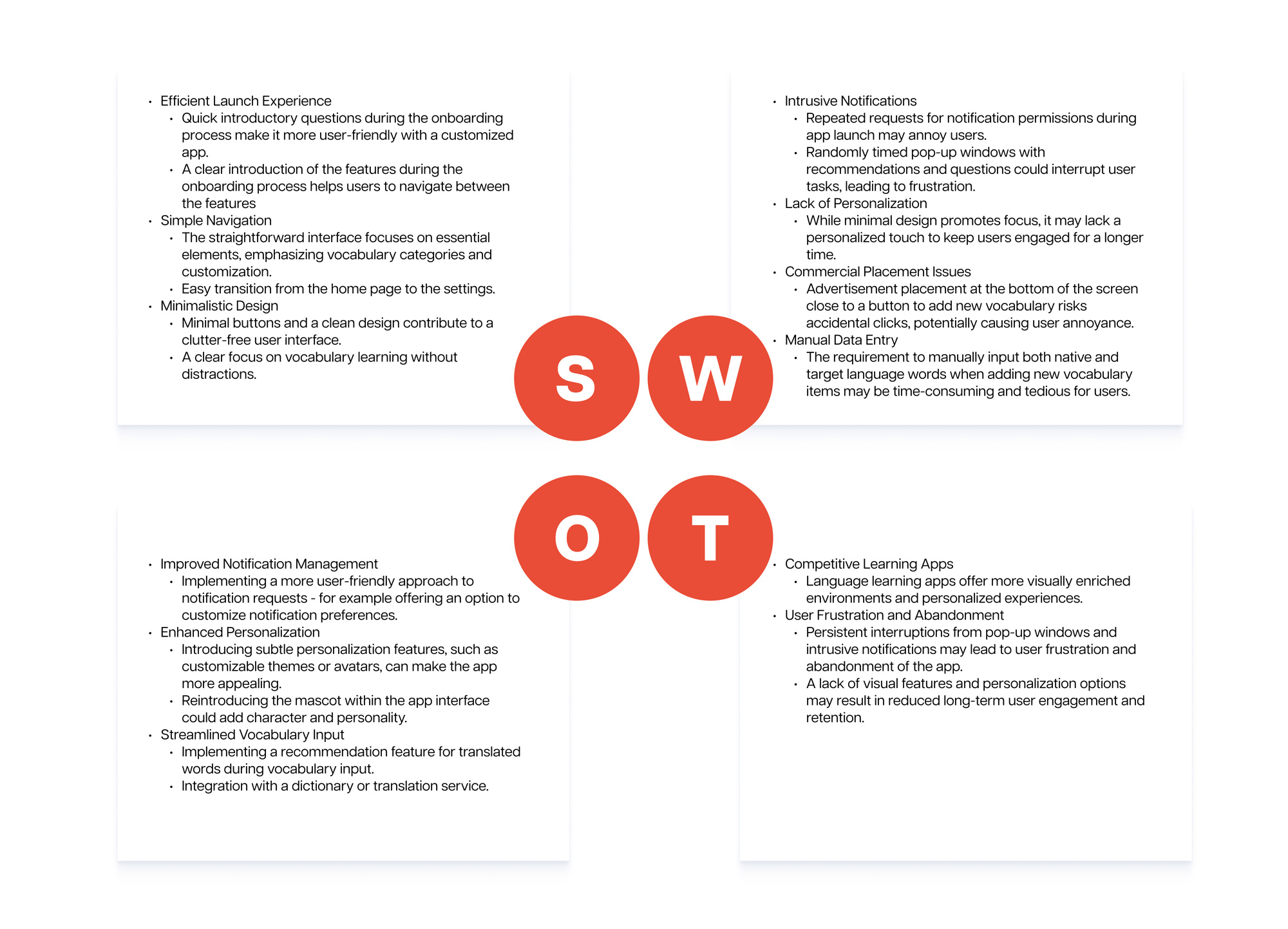
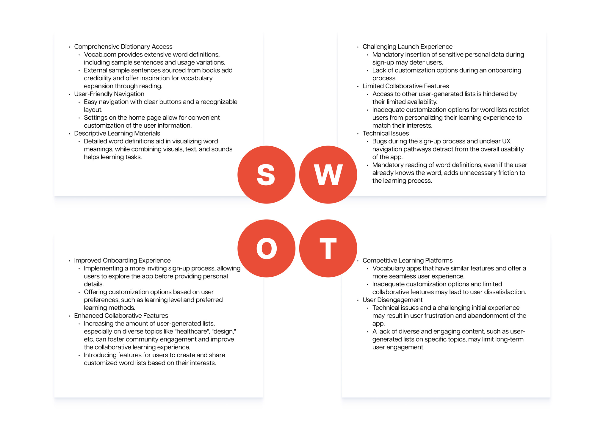
Competitive analysis was conducted on three competitors on the market – Duolingo, Flexilize Flashcards and Vocab.com. Each of these competitors had different features our users were seeking in one application.
Duolingo was visually compelling and had an engaging gamification. Flexilize had an easy-to-use flashcard system for memorizing new vocabulary and Vocab.com had an external vocabulary connected to an app. Each of these apps contributed to the flow of the main features of an application to cater to our main user group.
3. Defining users needs and problems
To understand users’ needs and problems, I conducted 4 user interviews with potential users. The intention of the interviews was to understand users key challenges, behaviours and goals while learning a new vocabulary. All the interviewees were professionals, who faced new vocabulary daily. They had learned also several languages through in-depth language courses and mobile apps.
User insights
1. Users want to have a structured overview of grammar.
2. Users need various learning methods – visual, audio, reading and kinesthetic.
3. Users want to categorise the learnt vocabulary in various ways to be able to learn it in different context.
4. Users need a motivational push to start to use the learnt vocabulary in real-life situations. Some of the tasks could be assigned for users to complete in real-life scenarios.
5. When learning a new vocabulary all of my interviewees admitted that they need to physically write down the words to remember them through the mind-body connection. Therefore an app should encourage a user to write down the notes and vocabulary on paper.
Persona
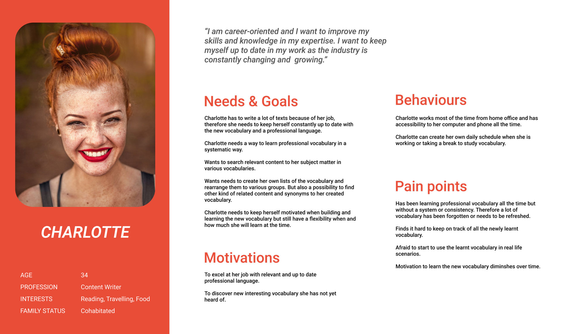
Based on the user interviews I was able to take away the key elements from each interviewee and implement them in our persona Charlotte. Our personas needs, goals and behaviours represent the main characteristics of our regular users, which helped to lay the groundwork for the main features of an application.
4. Building an IA
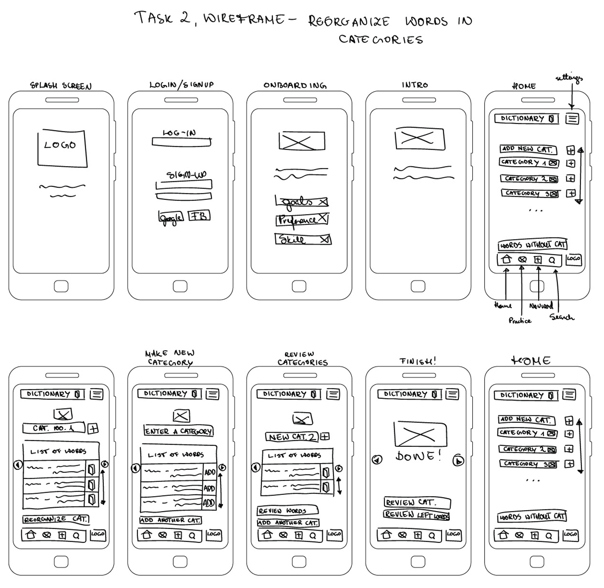
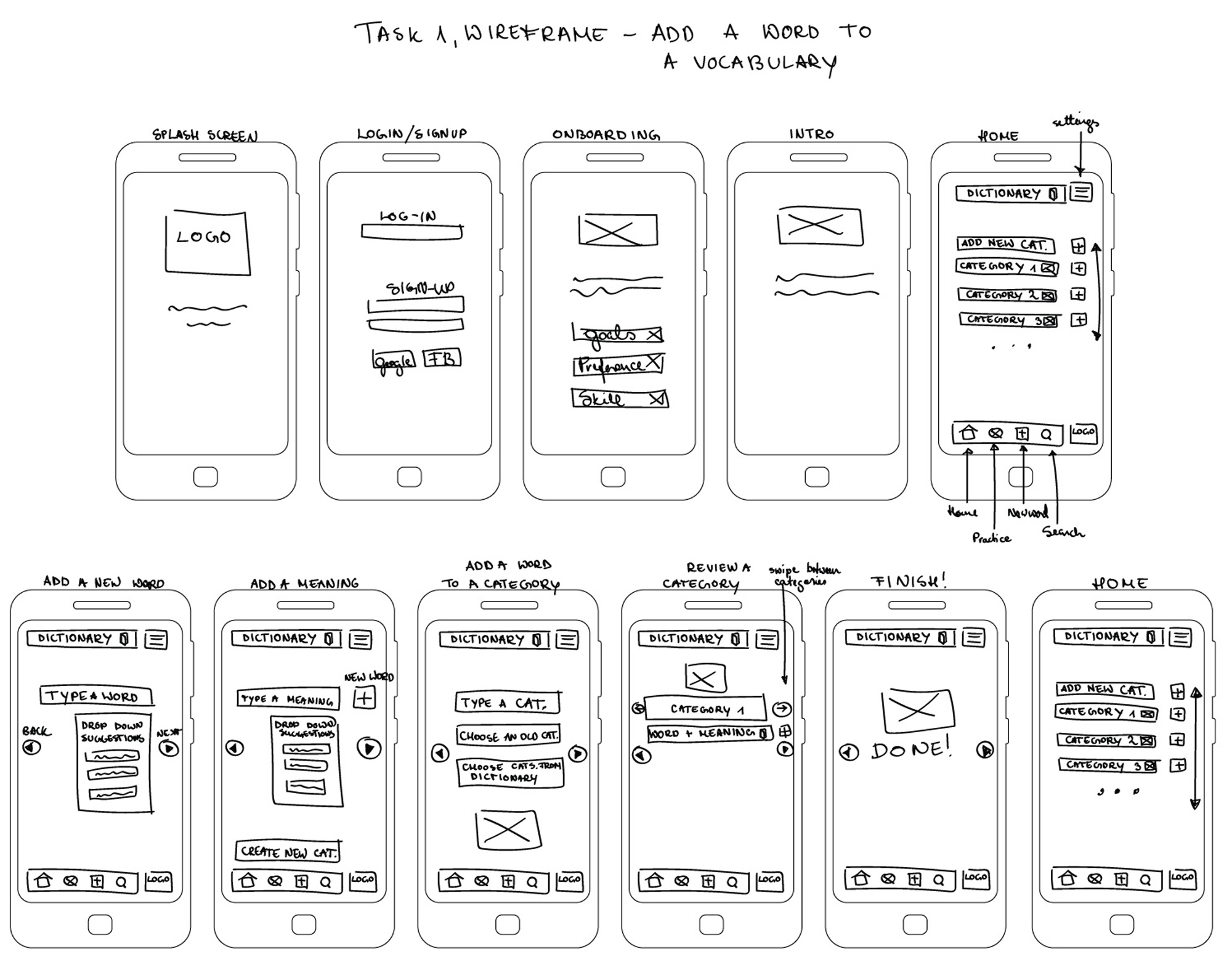
Based on the background of our persona, I created 2 task analyses and wireframes for the key features of an app. Firstly adding a word to a vocabulary and secondly reorganizing the pre-created vocabulary based on individual preferences. Task analysis was the starting point for low-fidelity wireframes, which were used for the usability tests later on.
Task analysis 1
User goal: Add a word to a vocabulary
Entry point: Splash screen
Success criteria: A word is added to users vocabulary and displayed on homepage
1. Open an app on a splash screen
2. Fill in login details or create an account
3. Homepage
4. Click add a new word
5. Autofill suggestions
6. Add a meaning to a word
7. Add another word or adda word to a category
8. Create a category or choose from preexisting category
9. Review a category or return to homepage
Task analysis 2
User goal: Shuffle words within categories (for example verbs, adjectives, nouns or labels like food, travel, design etc.)
Entry point: Splash screen
Success criteria: Words are place into a new category
1. Open an app on a splash screen
2. Fill in login details or create an account
3. Homepage
4. Open a pre-existing category or create a new category
5. View a category
6. Make a new category
7. Review ne categories
8. Make another category, add new words to new category or return back to homepage
rapid wireframing & prototyping
5. Usability Tests
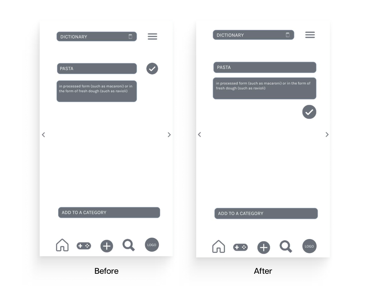
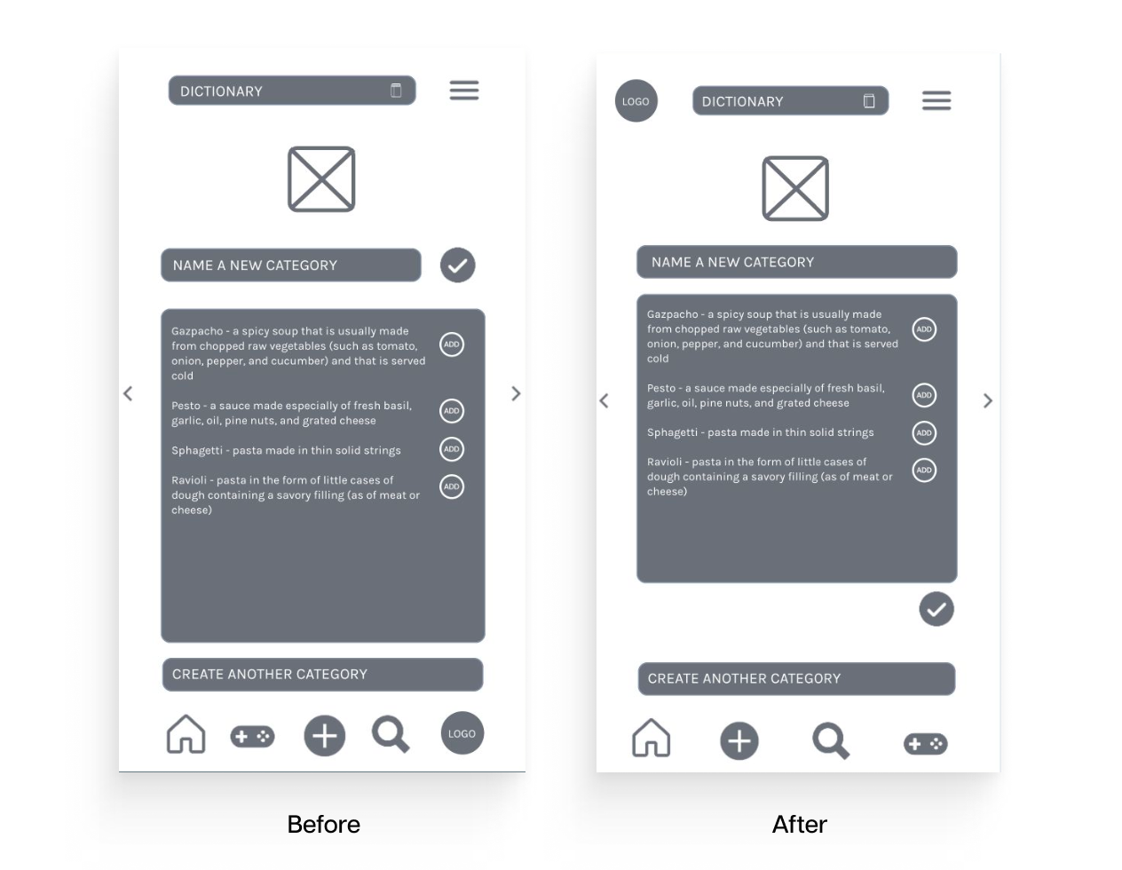
Usability tests for main features were performed with mid-fidelity wireframes. Direct and scenario tasks were both used to see how potential users navigate through each task.
I conducted three remote tests through Teams and Zoom and the users’ navigation was recorded through screen share. Each session lasted 10-15 minutes.
All the findings and observations were analysed based on Jacob Nielsens severity scale in a usability test report.
methodology
Test type: Moderated in-person and remote
Tested version: Mobile
Participants: 4
Evaluation metrics: Jakob Nielsen error severity rating scale
Participants were allowed to take part in their choice of environment through mobile phones. To be able to evaluate the information later on, the participants actions were recorded through screen sharing. Throughout the test, participants were continuously interviewed about the task completion.
Direct Tasks
1. Sign up and onboard.
2. Log in.
3. Add a new word to an app and create a category.
4. Reorganise the pre-made category.
Scenario Tasks
1. You downloaded Cram vocabulary app because you need to
memorise lots of new vocabulary in the cooking courses you are
taking. Before using it you need to sign up and complete a basic
introduction.
2. You have downloaded the Cram app and completed the sign-up
process, now you need to log in to start using it.
3. You just learned the word “pasta” at the cooking course and you
want to add it to your vocabulary together with the meaning of a
word. After adding the word you will also create a new category
for it, named “food”.
4. You want to reorganise your pre-made category named “food”
and create a new category named pasta. From the list of words,
you want to add different pastas to a new category.
Usability test report

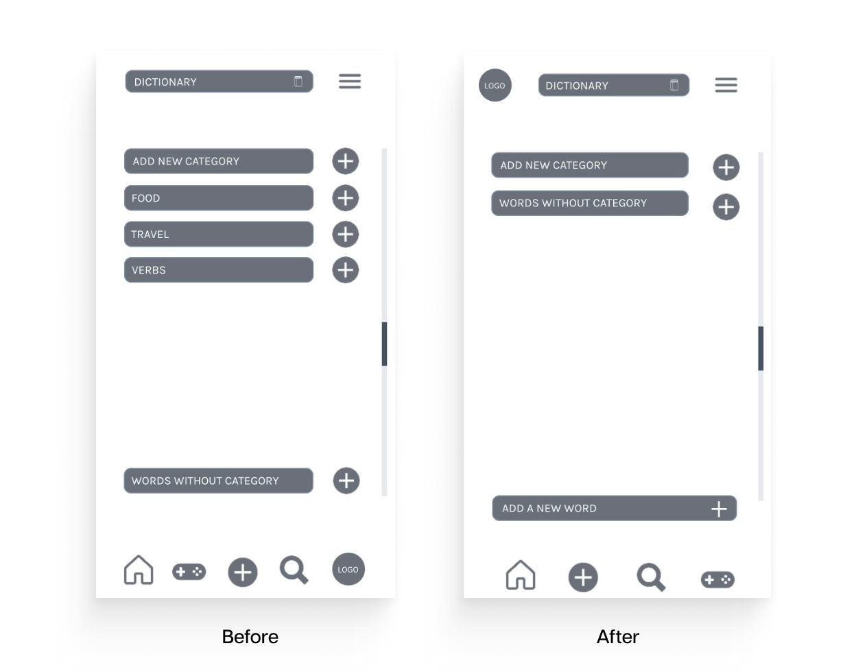
Prototype iterations

6. Summary
Project Conclusion
Even though the language app market is already really competitive, the user interviews and competitor analysis revealed that there is room for a successful product but it should be tailored for a specific user base.
What came out from the conducted user interviews was that users were missing structured grammatical systems in various language apps. Therefore for serious learning experiences, they often opted to participate in-class language lessons instead of mobile applications. But to have a successful learning experience, they still had to use several dictionaries and liked to study language through gamified apps. Also browsing through databases gave them a sense of creative control over their studies, which eventually helped to balance other strict study methods like learning by heart and doing repetitive tasks.
These user needs can be translated into the key features of an app – which in a balanced combination of clear information and simple gamification will prove to be the successful base for attracting students and professionals who want and need to learn vocabulary daily. An app should include tasks which encourage users to practice language in real-life settings and use kinesthetic tasks – like writing words on cards by hand.
Personal Learnings
This project showed me how much the initial idea of a simple application can change through variety of user research. It helped to think outside of the box – what we usually expect from a product or service, and what are the actual pain points a user encounters throughout their learning process. I found it immensely interesting how user research can be implemented in a visual design and I was glad to learn the methodological approach for conducting competitive analysis, user interviews and tests.