UI specialised responsive web design for real estate site
User Flows | Responsive Website | Moodboards | Design Systems | Brand Design
Real estate investments offer great financial security for people who seek a long and steady income, but for new investors, it might often feel overwhelming and confusing to filter out the necessary information. domes website goal is to offer relevant information on properties of interest for new investors.
Website creates a seamless experience through real estate interactions, by providing necessary information to new property investors about the current market trends and key points to keep their eye on through their transactions.
To provide this experience, Dome collaborates with several key agencies, who take into account each investor’s journey and offer relevant guidelines for new investors to follow.
Tasks
User Stories & Flows
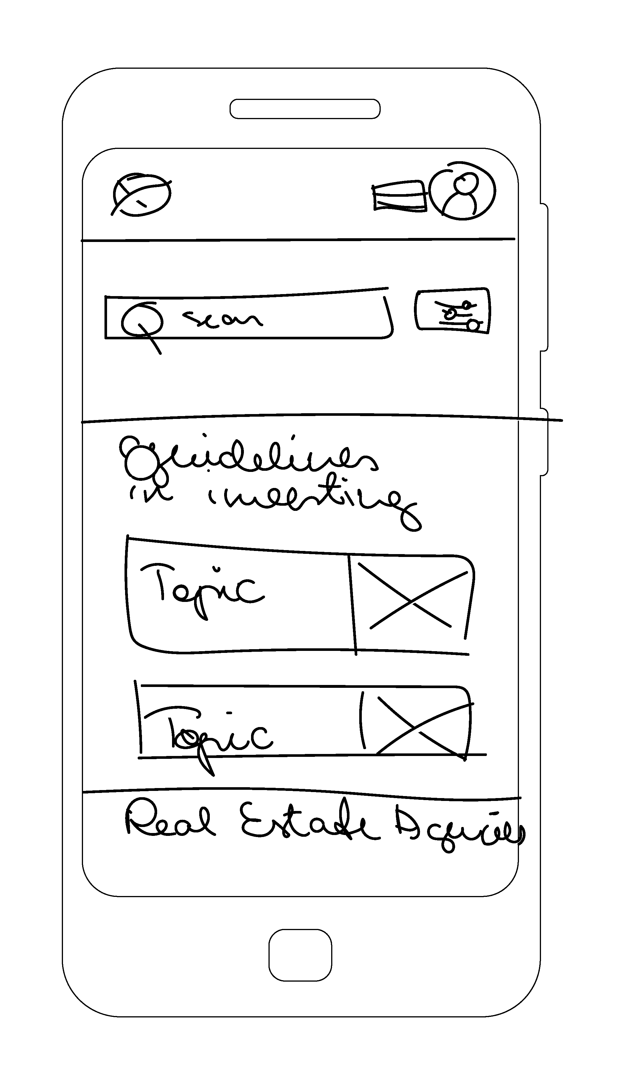
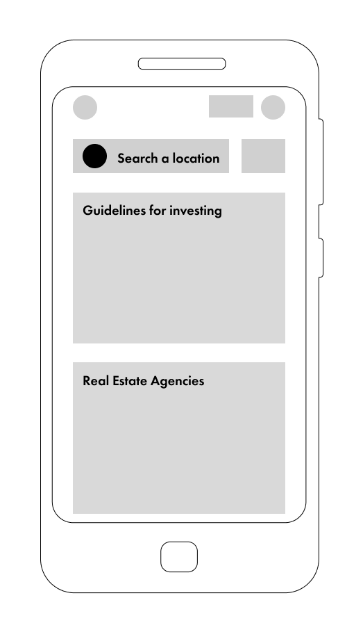
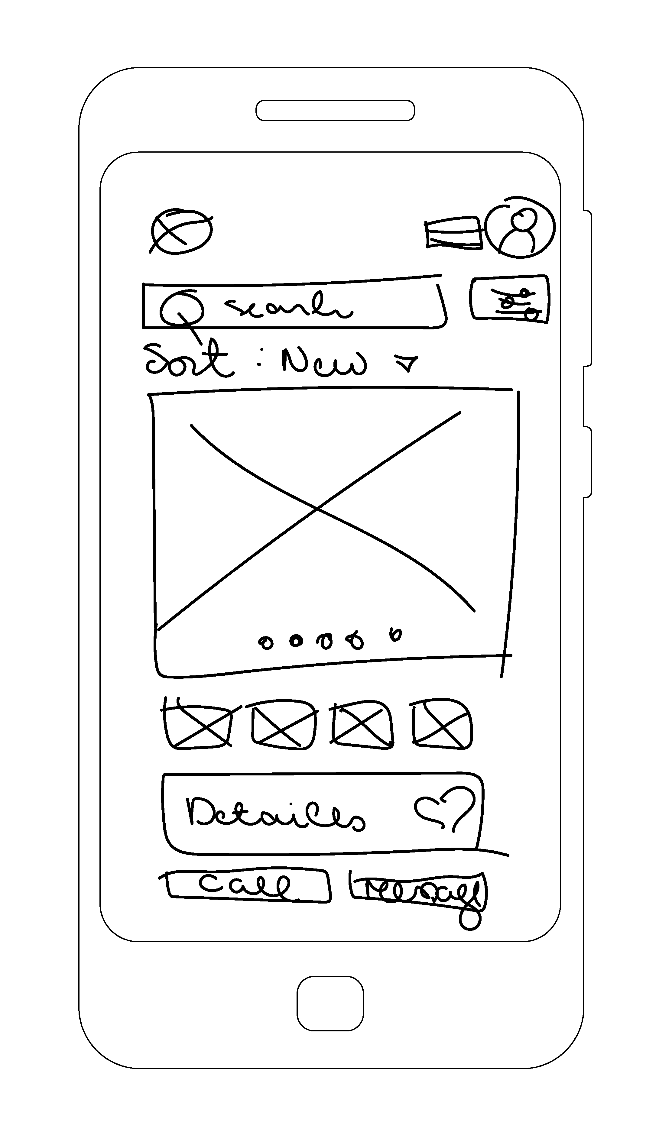
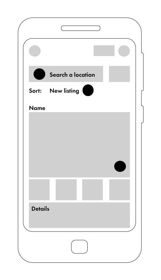
Rapid Wireframing
Moodboards
Logo & Icon Design
Typography
Colour palette
UI Elements
Style Guide
Tools
Figma
Photoshop
Illustrator
Rotato
1. Problem
Small-scale property investors need access to reliable, uncomplicated information about their potential property investments and the process of the transactions. They need to find suitable properties according to their criteria and access relevant guidelines from the partner agencies.
Solution
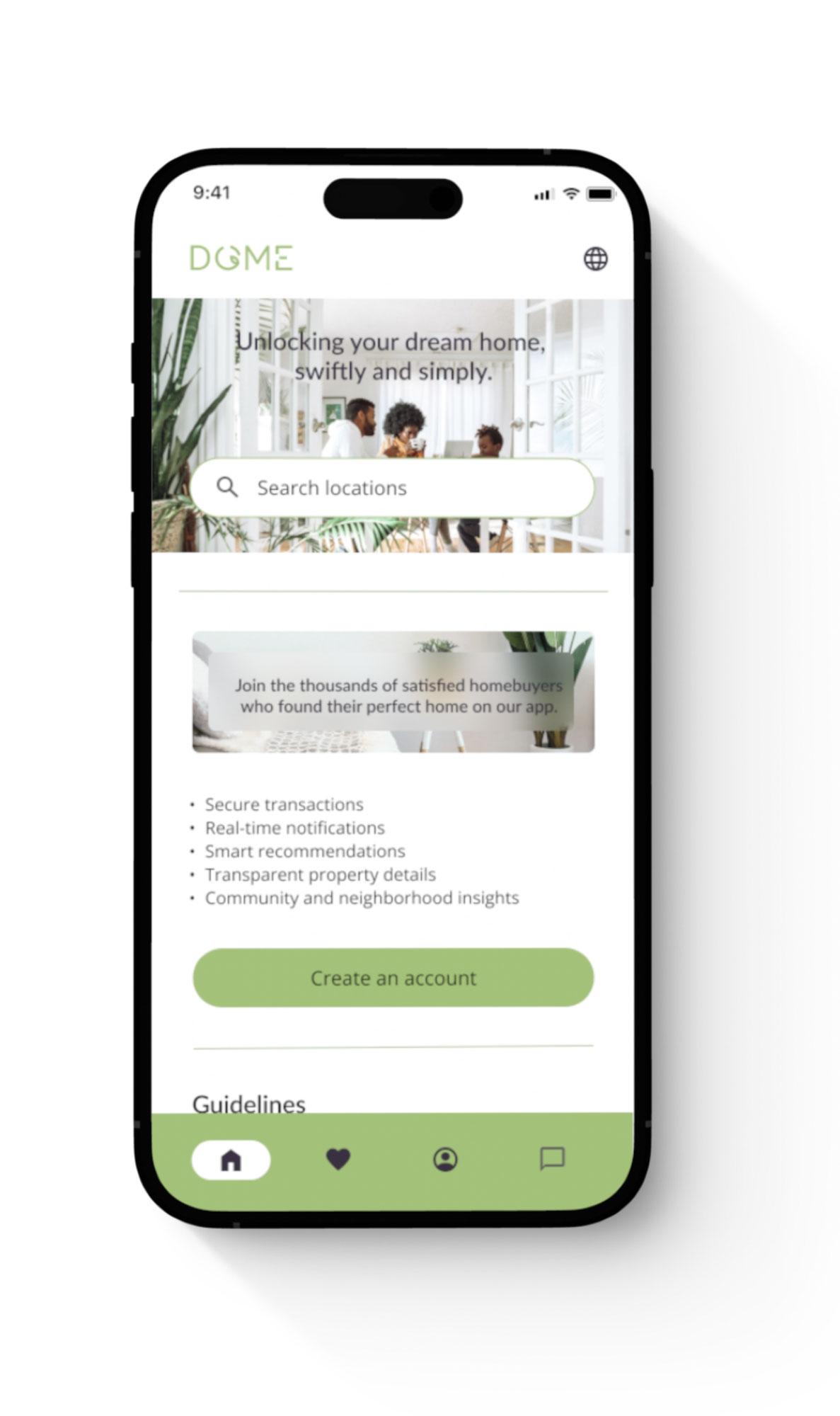
A responsive website which is easy to use on the go – everywhere and anytime. Where a user can find all the necessary guidelines about the different types of investment opportunities and can contact the most suitable partner agency to guide them through the process.
2. Defining users needs and problems
Persona
Based on the user interviews, insights and affinity maps I crafted 3 personas, whose backgrounds represent 3 diverse groups of users of an app. They vary in experience, sport, age, ethnicity and tech savviness. These personas were a base to create a variety of user flows to draft down all of the possible frustrations and journeys a user might take.
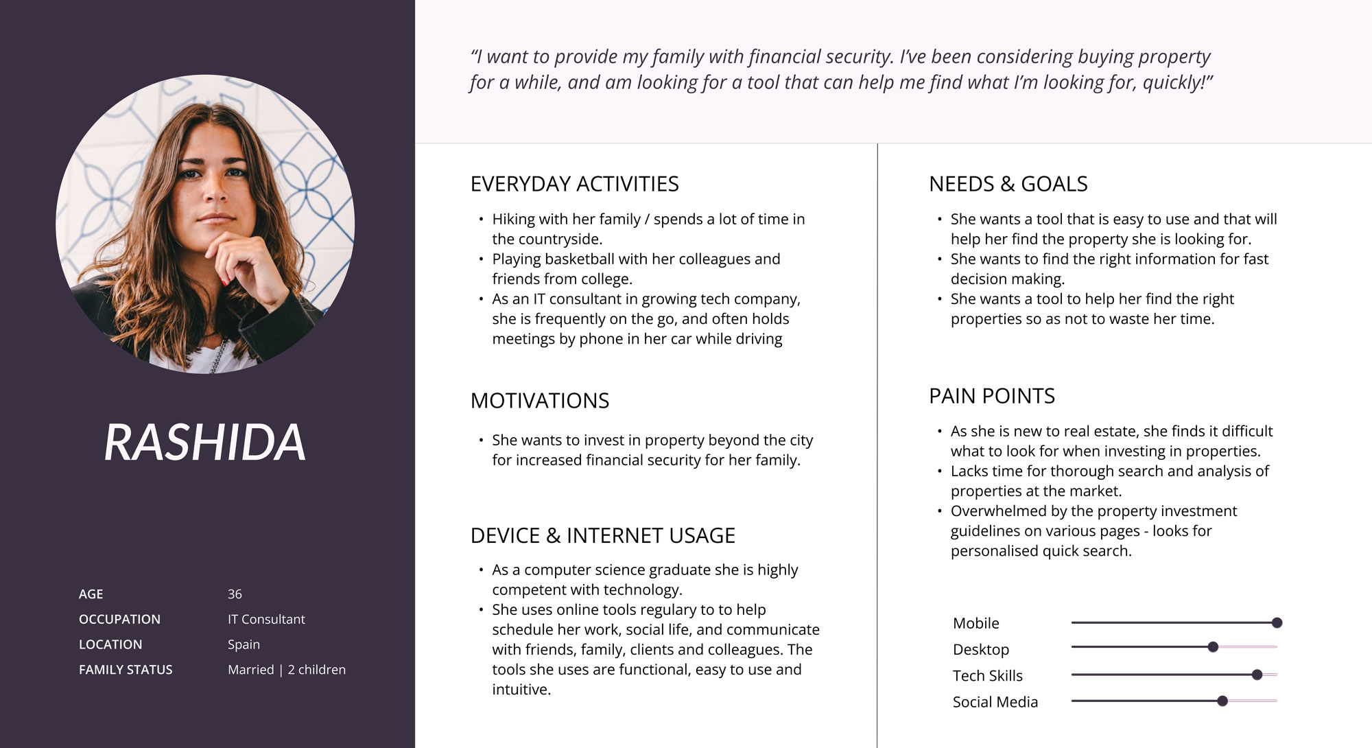
To be able to define the Domes main focus and features I used the personas background, assigned by the brief, to identify the users’ needs, goals and wants as a base to create the main user flows for a website.
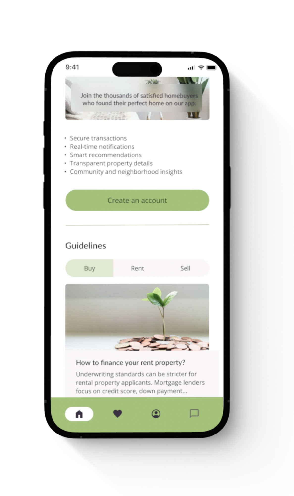
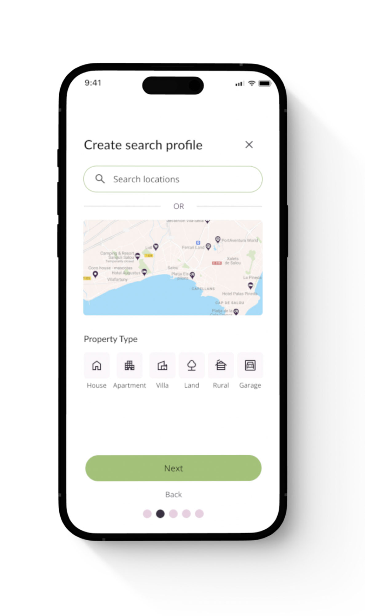
User flows helped to identify the key features and needs of our persona – Rashida. For example, creating a customised profile for quick searches, a map feature, a blog for finding relevant information about the investment possibilities or booking a slot with a partner agency broker, who can offer specialised guidelines and in-depth guidance about the real estate market.
User stories & flows
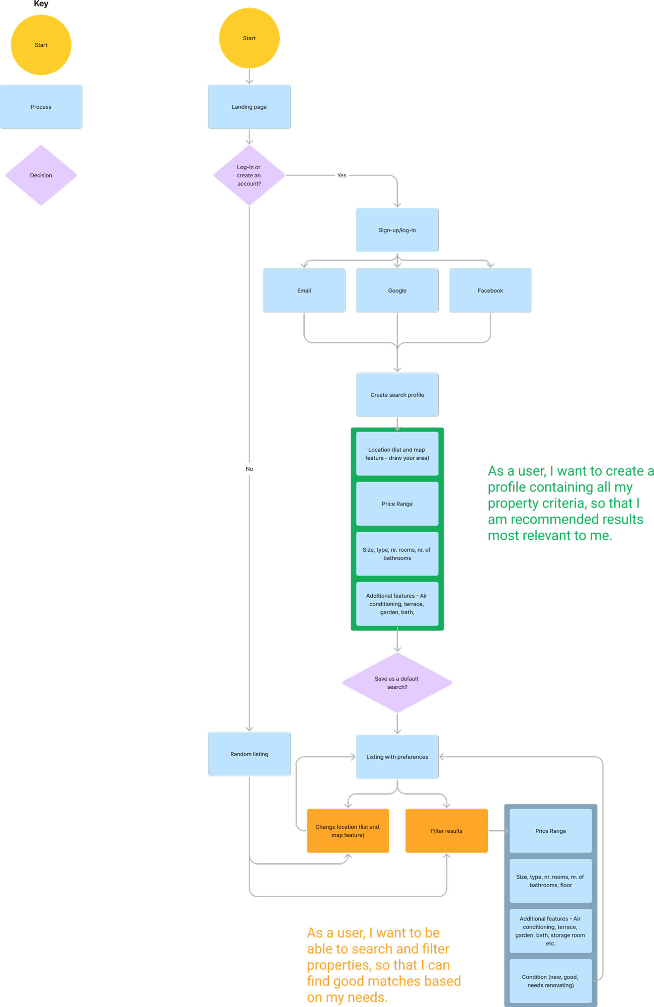
Problem 1
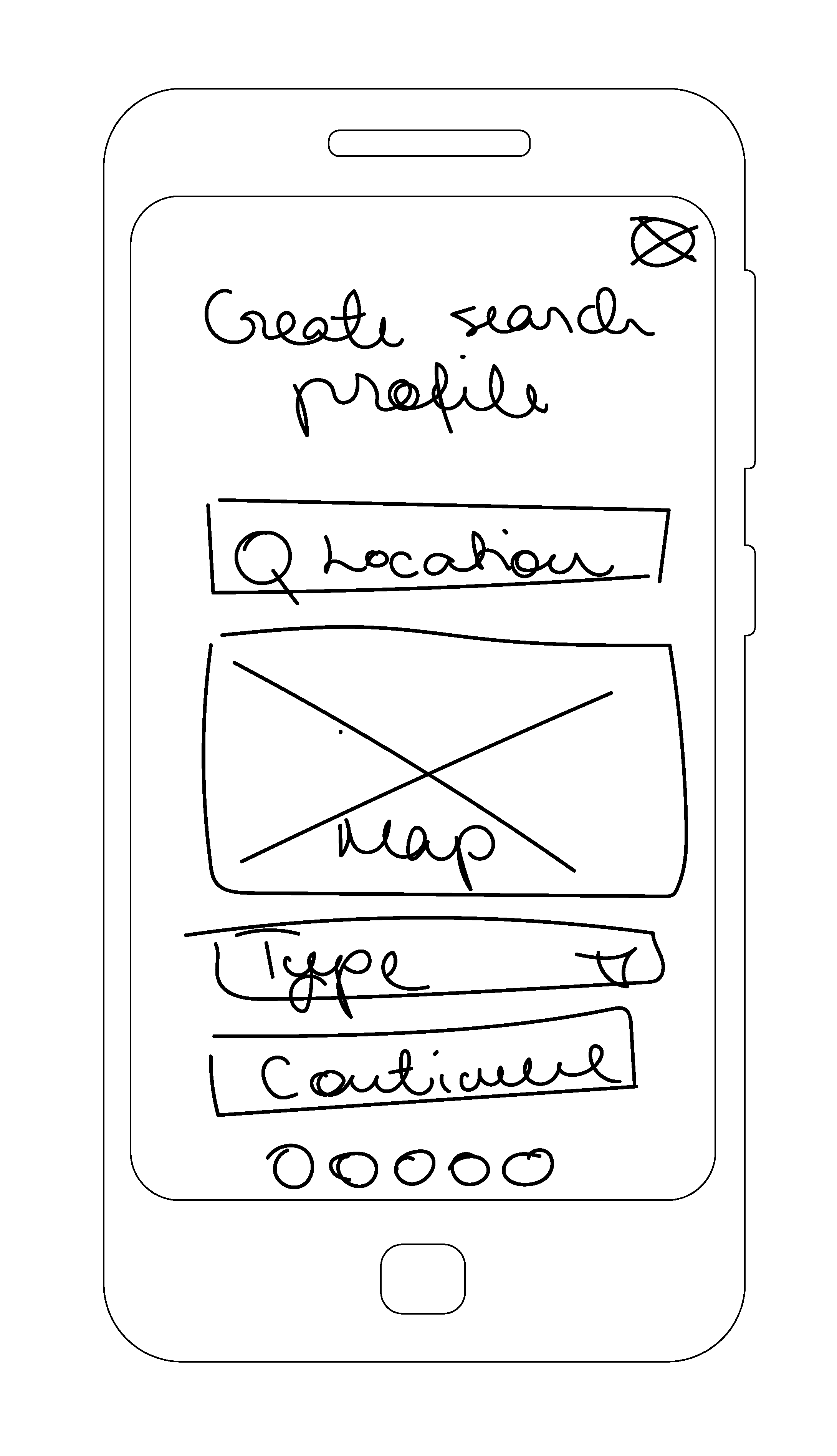
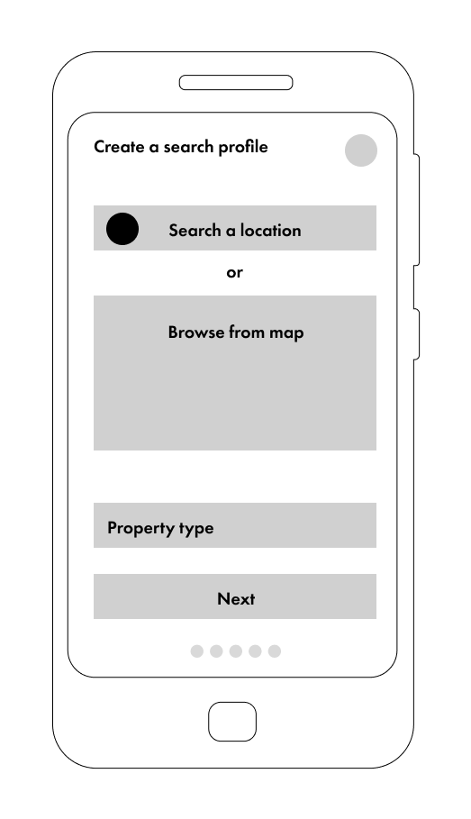
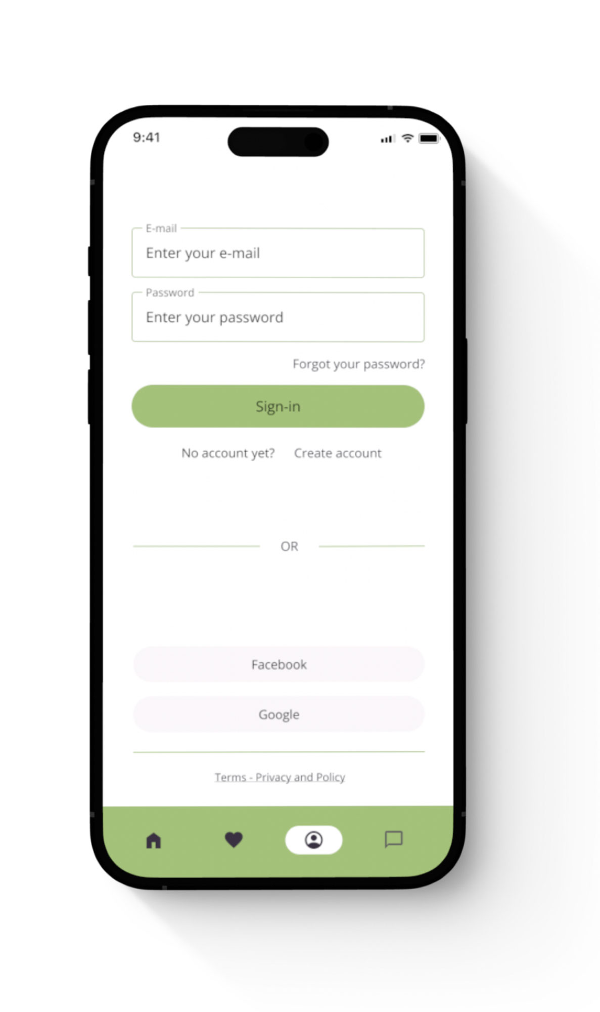
“As a user, I want to create a profile containing all my property criteria, so that I am recommended listings tailored to my preferences.”
Solution A
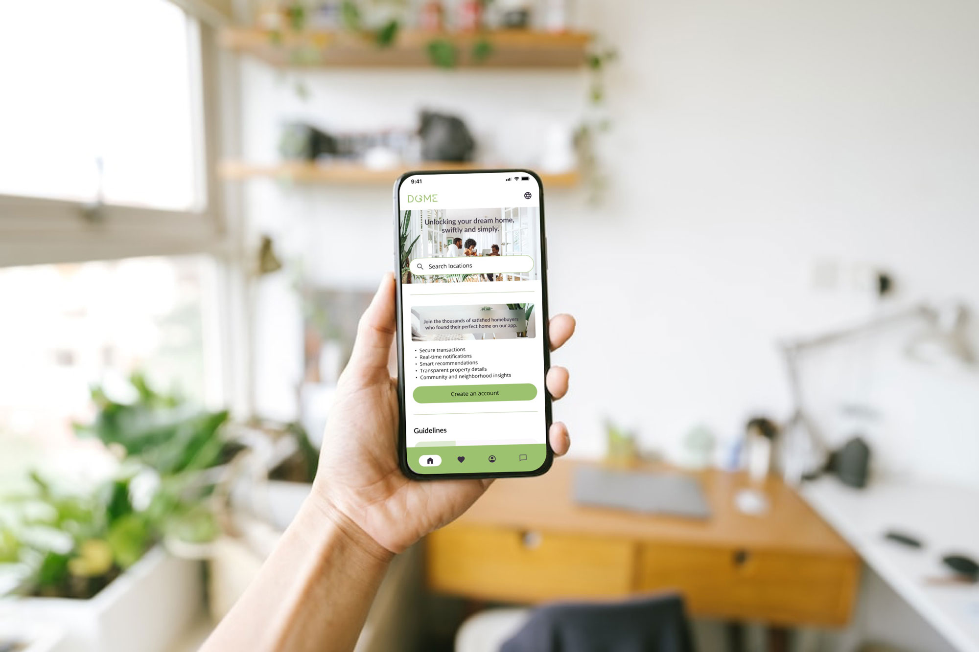
After the customisation process, landing page guidelines feature updates to recommend the most relevant articles about properties of interest.
Solution B
After the customisation process, the most relevant agencies, based on their experience and focus, are filtered for a user to see.
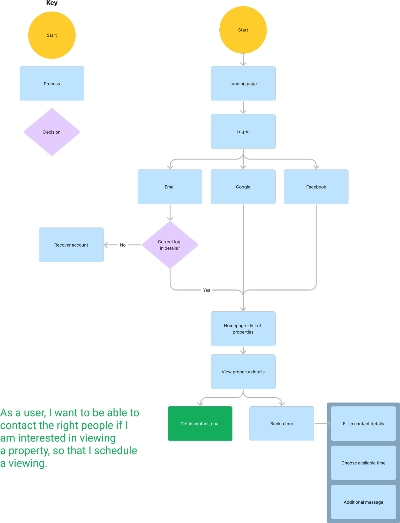
Problem 2
“As a user, I want to access as much written and visual information as possible about the properties I am interested in so that I can make informed decisions.”
Solution A
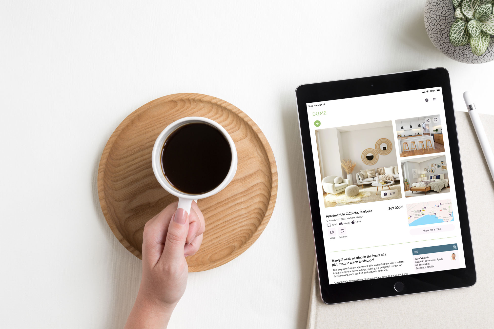
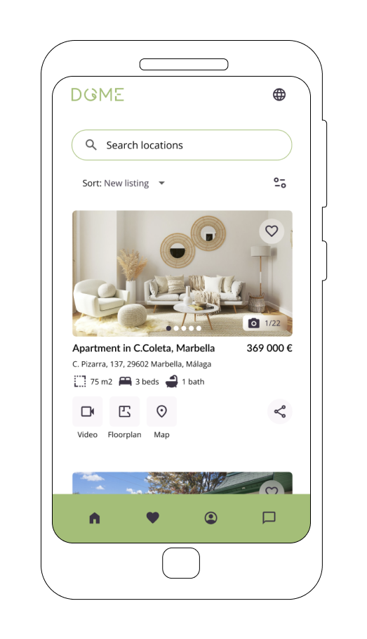
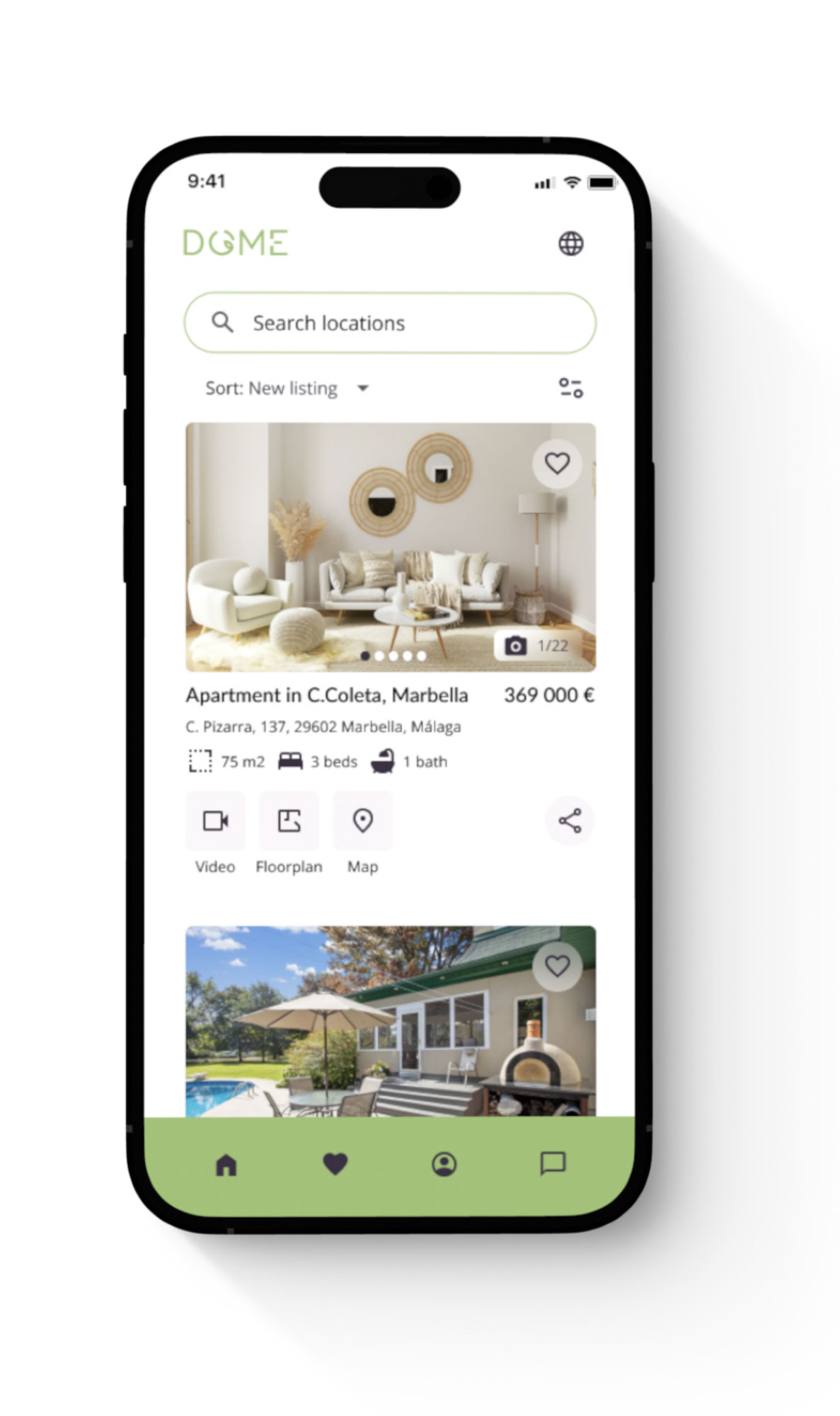
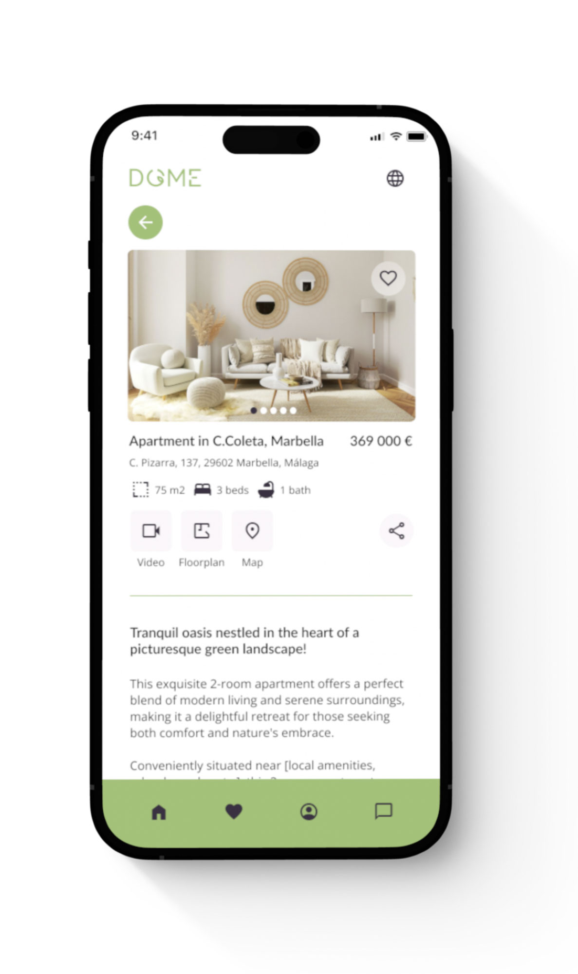
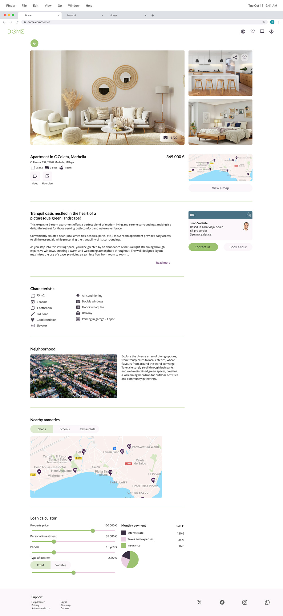
A user can access in-depth information about the property features through the property listing page. Information includes images, a 3D video tour, amenities nearby and a detailed list of features.
Solution B
A user can use the loan calculator on the property details page to get information about the possibilities for extra finances.
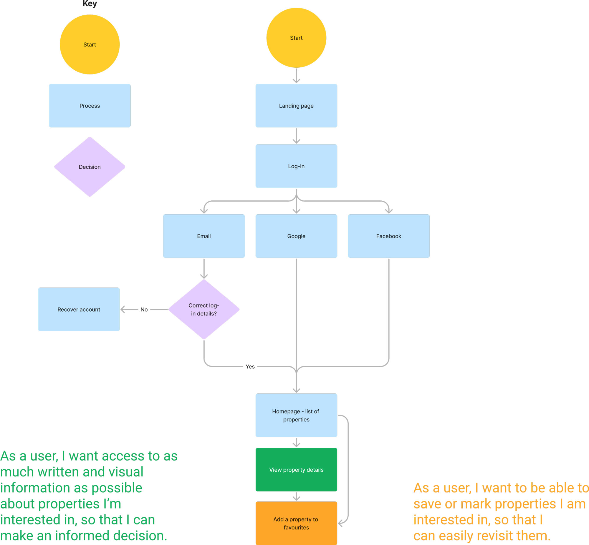
Problem 3
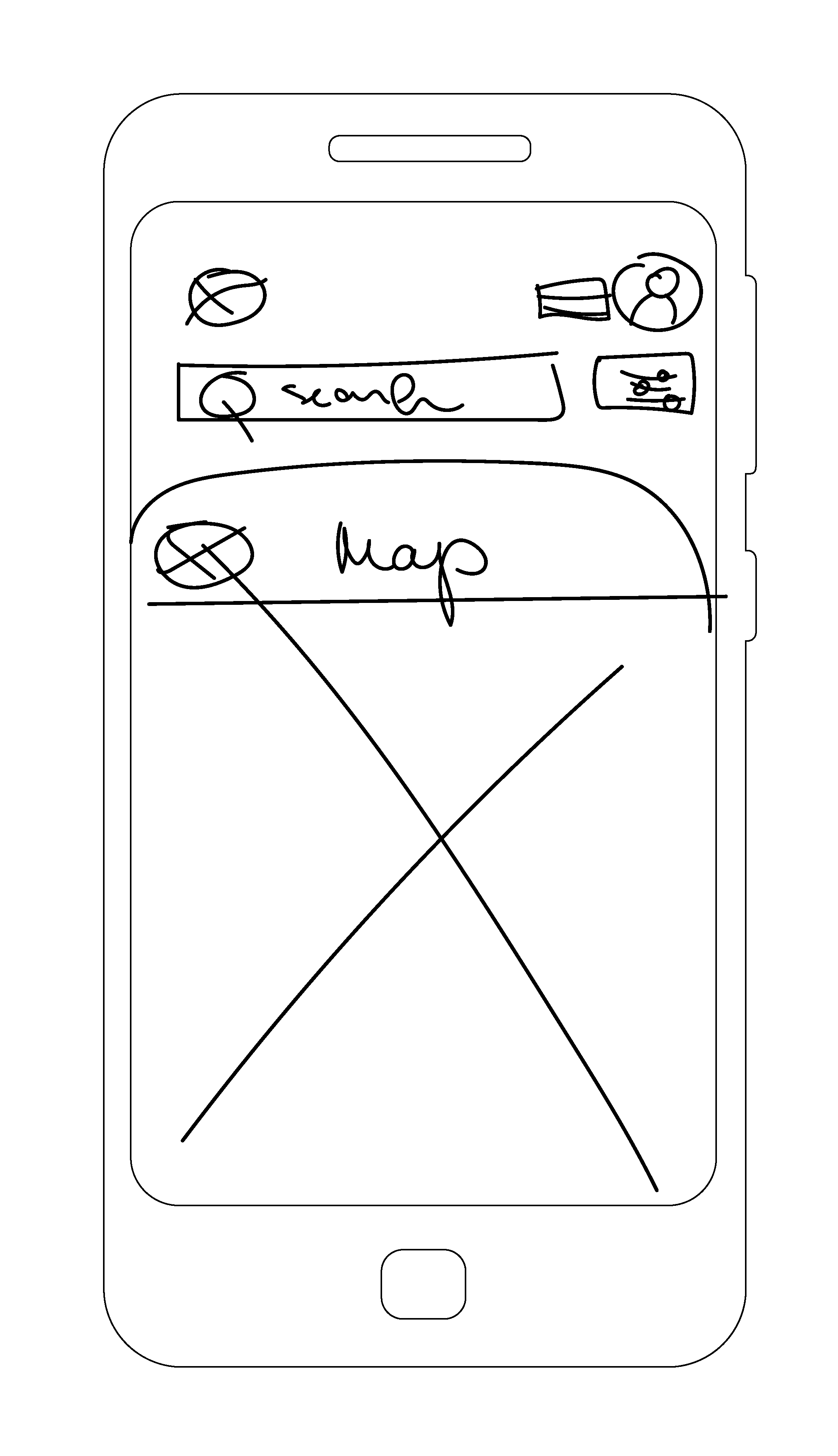
“As a user, I want to be able to search properties, so that I can find good matches based on my needs.”
Solution A
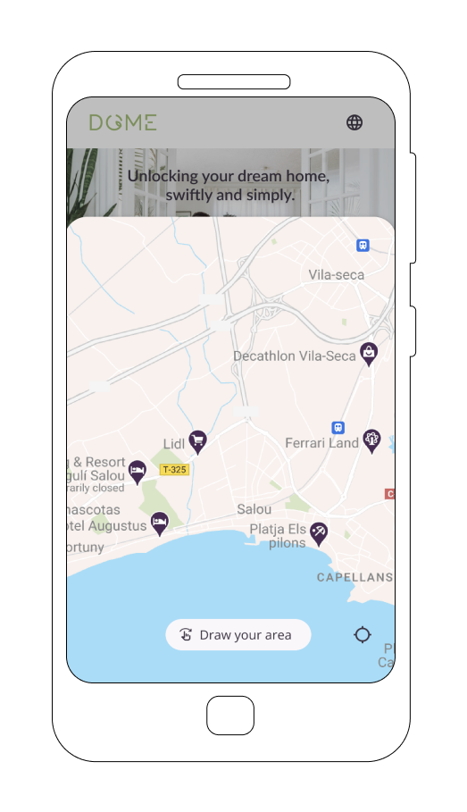
A user can filter properties from a search feature on an interactive map, where she can draw the desired area according to her liking.
Solution B
A user can add the property to her favourites list to be able to compare them for future reference.
3. Moodboards
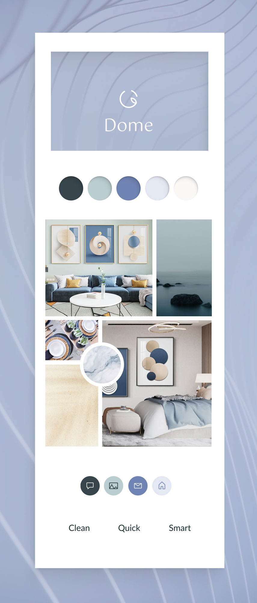
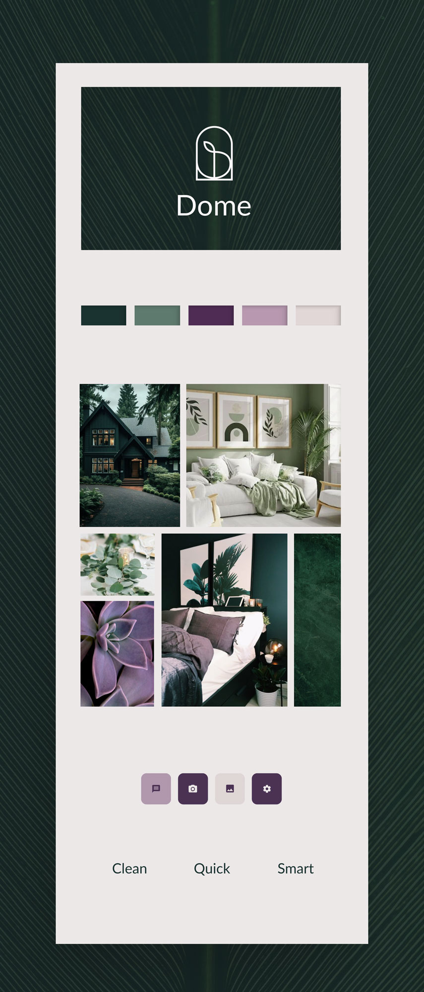
Based on the project brief I created 2 contrasting moodboards. Assigned colours were blue, green or purple and the keywords for design were clean, quick and smart.
The first moodboard was sleek blue inspired by Scandinavian minimal design. This moodboard followed more of the project keywords – clean, quick and smart. But together the blues and the minimal design together created too distant and anonymous environment. The second moodboard consisted of greens and purples and was inspired by minimal Art Deco graphics. While these colours were more inviting and aligned with our personas’ personal appeal, the Art Deco graphics created a too-sophisticated and detailed feeling.
My solution was to combine both moodboards and choose the elements which aligned with both – the project brief and personas background. I used greens and purples as the brand colours, yet kept the logo and other elements as minimal as possible.
5. Style guide elements
Logo
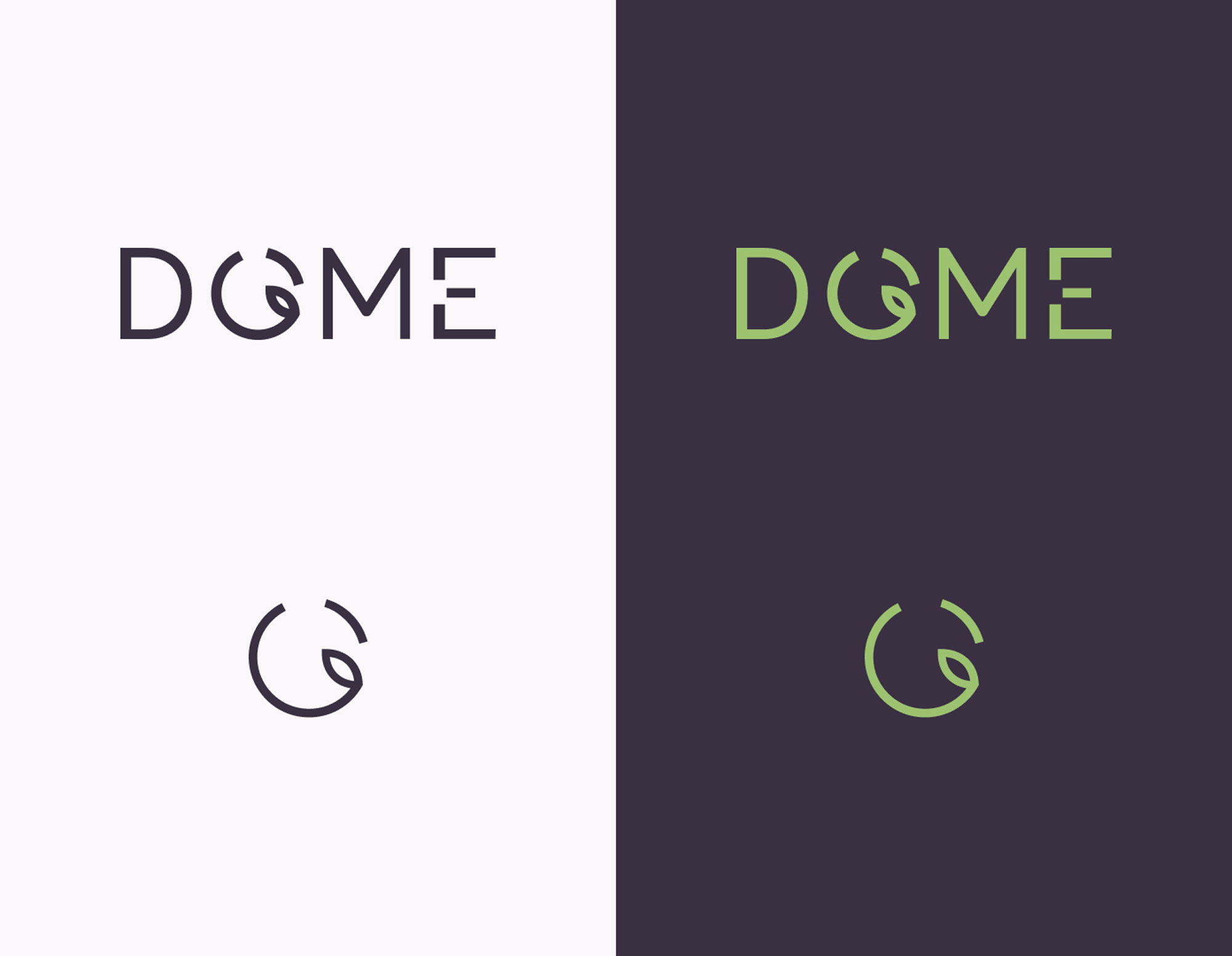
The logo consists of two parts – an icon and a full logo with text.
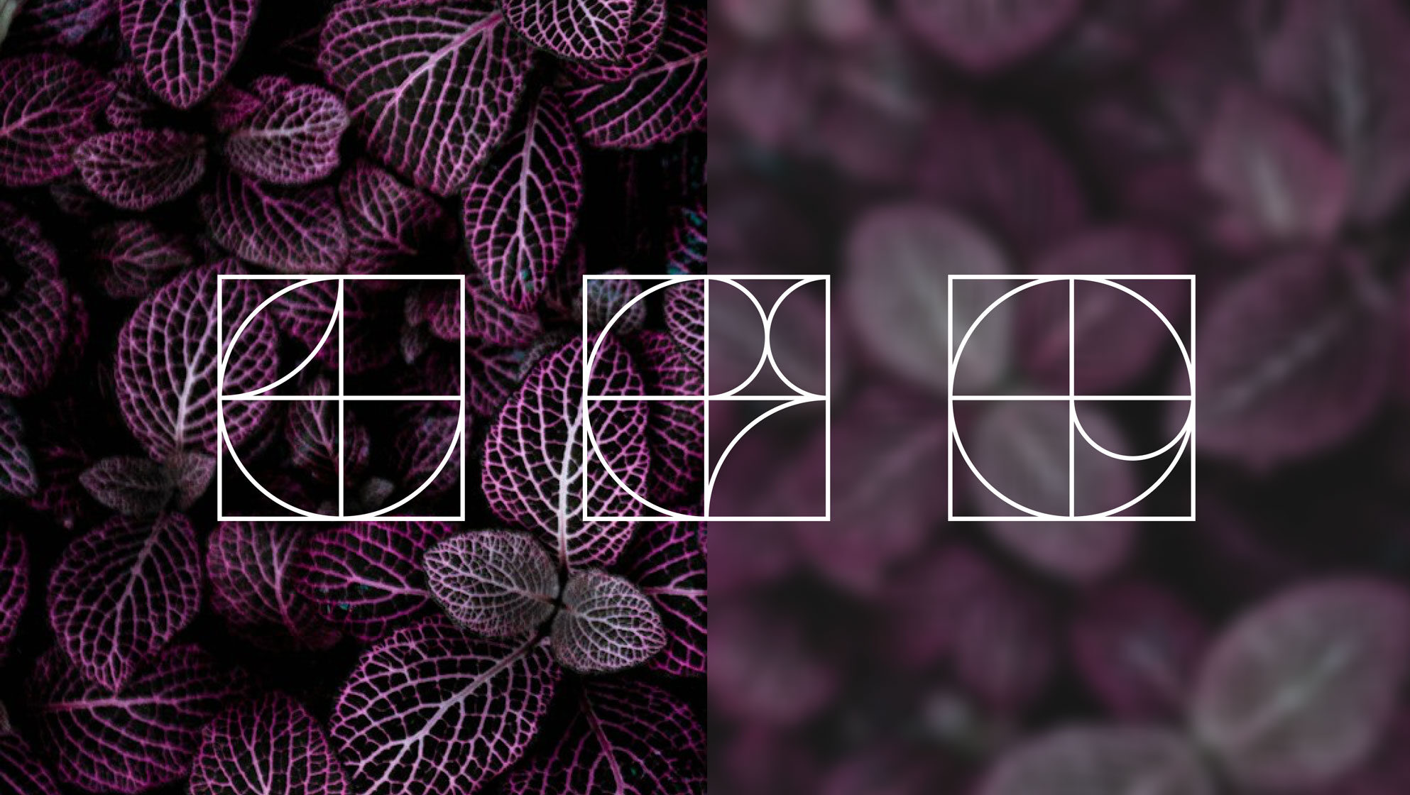
The variety of patterns indicated below can be used as a design element for various backgrounds and products.
colour palette
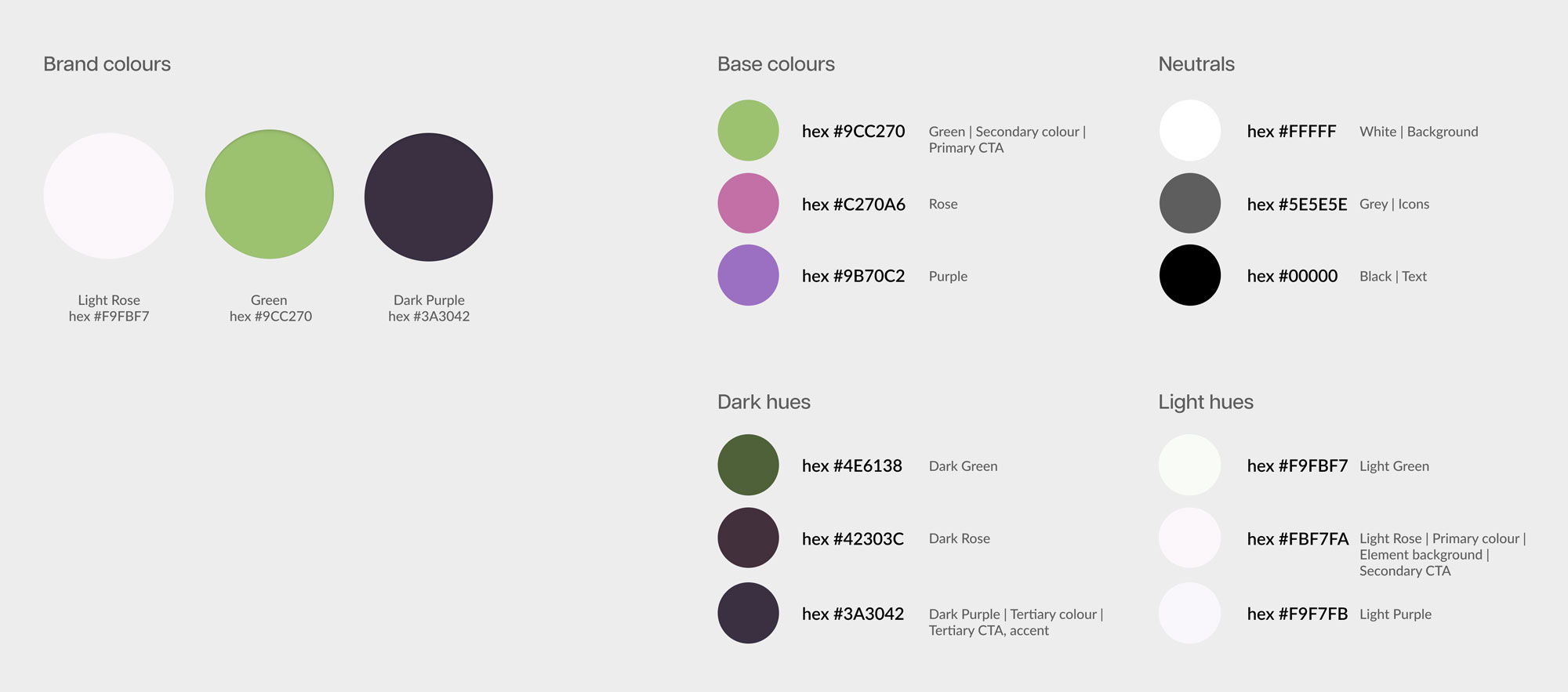
The brand consists of two main colours – green and dark purple. The third colour light rose is used as a main background colour for the elements and surfaces. These colours were defined by using a split complementary colour system. The light rose and dark purple are shades of the base colour.
The brand background is white, so green and purple can guide users through the main navigational systems. Green is assigned for primary CTA-s, while purple functions as an accent. Purple in combination with light rose also serves for the secondary CTA-s. All the colours comply with WCAG AAA Guidelines.
Typography
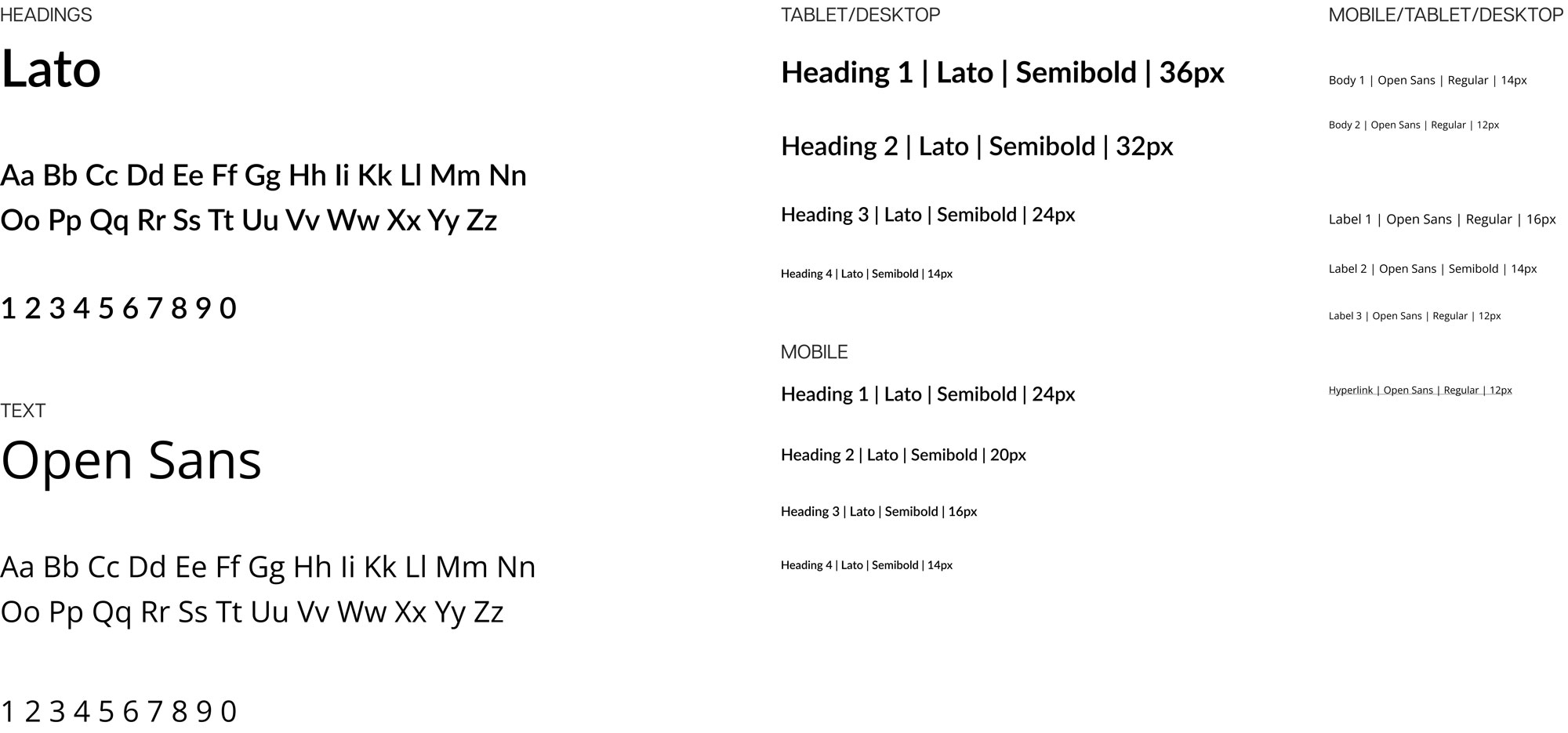
Typography has to be simple and consist of sans-serif typefaces to suit for mobile devices.
Iconography
Icons are from the Material Design System. If the icon is not present in the system, new designs will have to be created based on the example below.
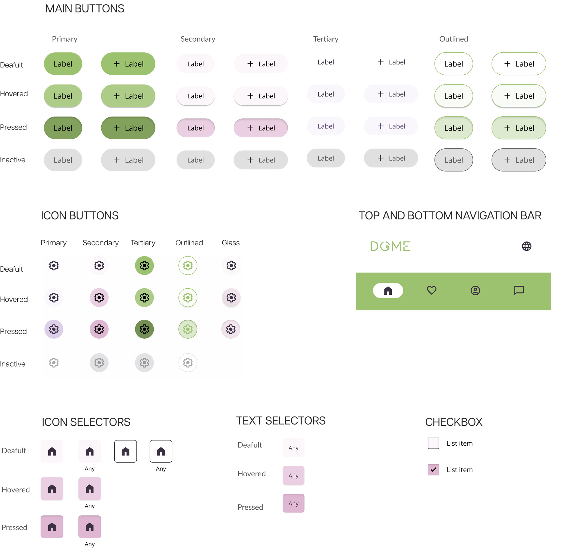
Main navigational UI elements
Splash screen animation
Imagery
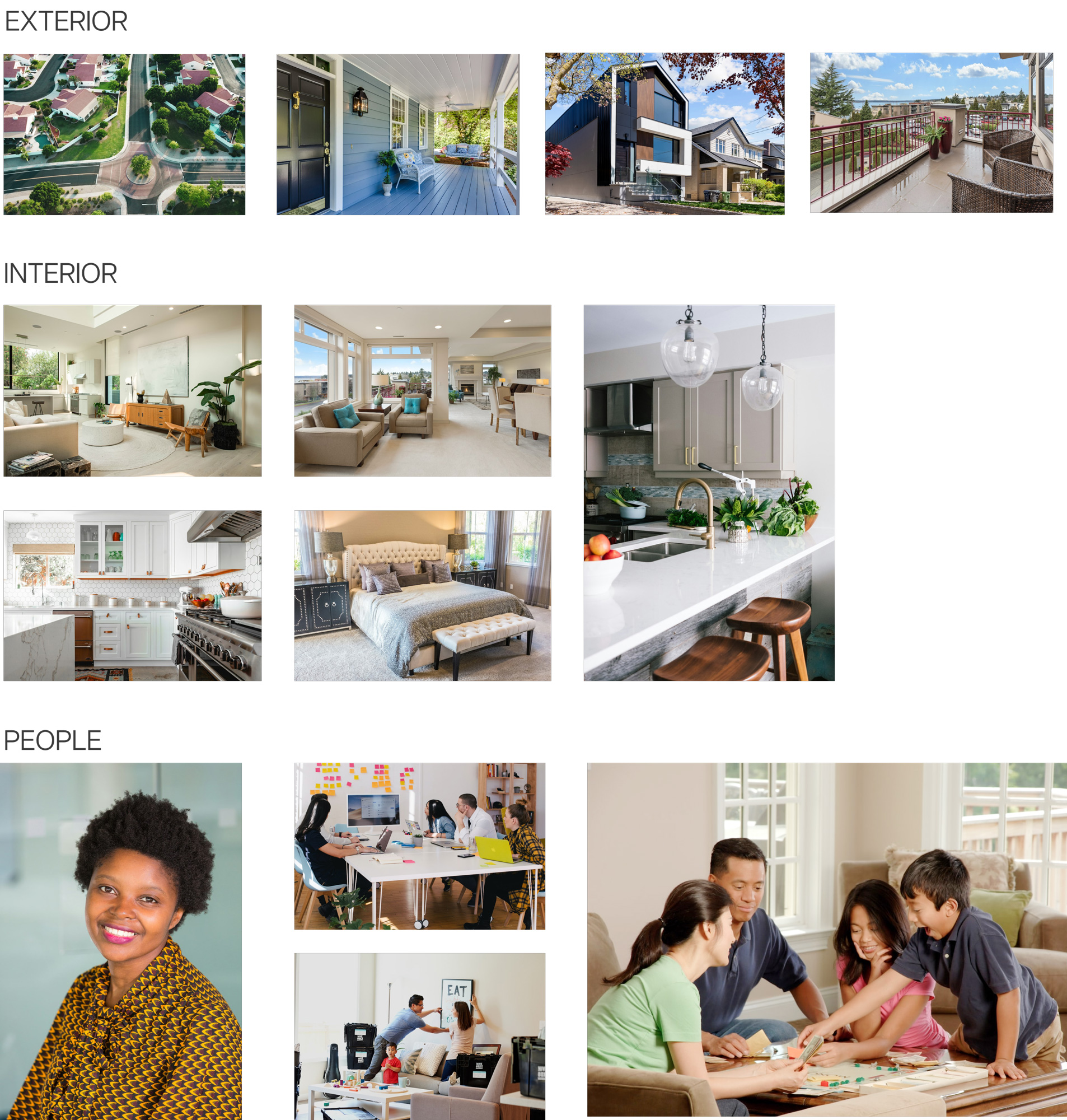
Appropriate images
Images have to be in natural tones and settings. Over-contrasting and saturated images are not allowed. Real estate images need to present the property’s layout, features and character in a correct and real-life manner. Images need to be of good quality.
Sites need to be cleaned beforehand so that the room and property would be in the main focus. Buildings need to be aligned properly on an image – preferably shot on a tripod.
Drone images need to show the characteristics of the neighbourhood and the property.
Interior images need to showcase all the rooms with all the entry points, so a viewer can understand the layout of the property.
Emotive and real estate agent profile photos need to be welcoming and natural.
Inappropriate images
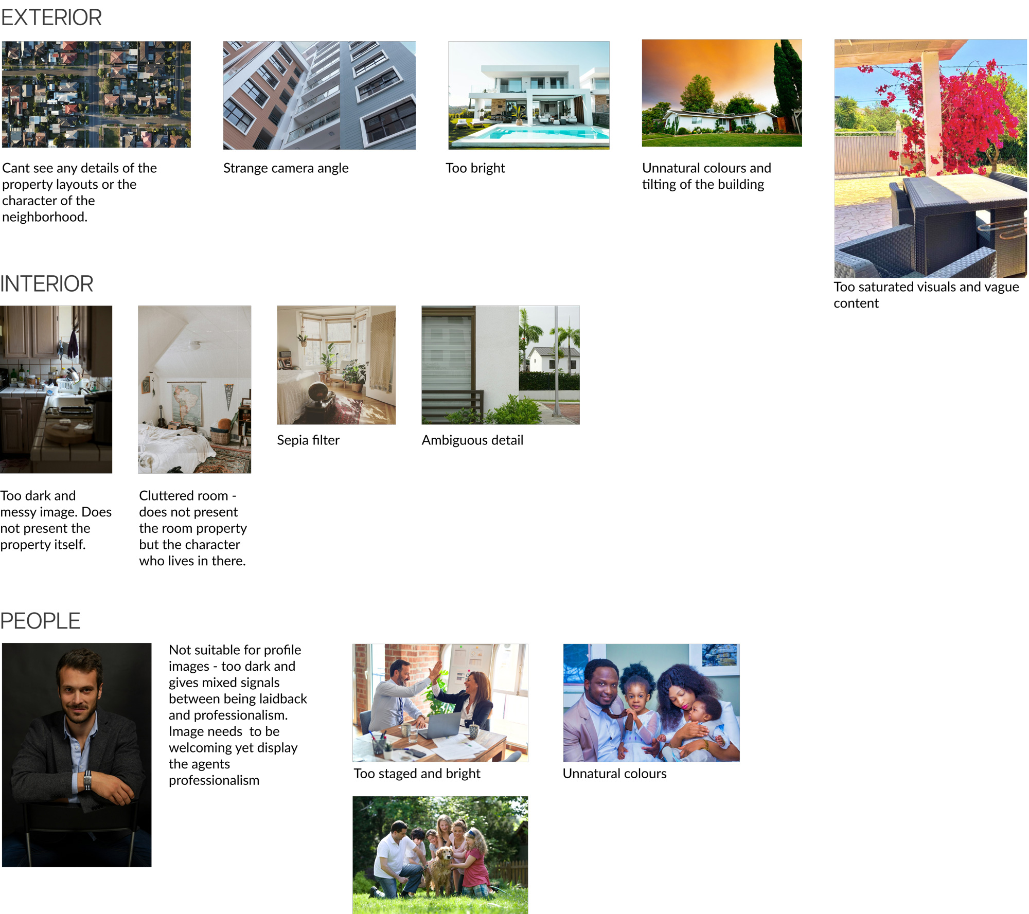
Avoid images which are oversaturated or too bright. Images need to showcase both – light and shadows.
Avoid images done on strange angles – from up to down or from down to up. No titled buildings.
Avoid drone photos done straight from the top, it does not convey necessary information about the neighbourhood and surroundings.
Avoid interior images from messy or cluttered rooms.
Avoid images with various coloured filters.
Avoid images of people, which are staged and unnatural
6. Responsive design
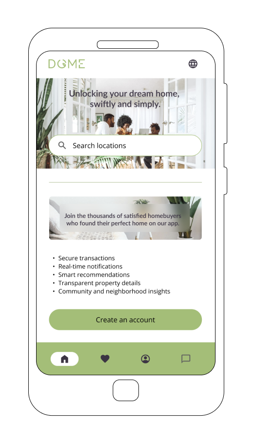
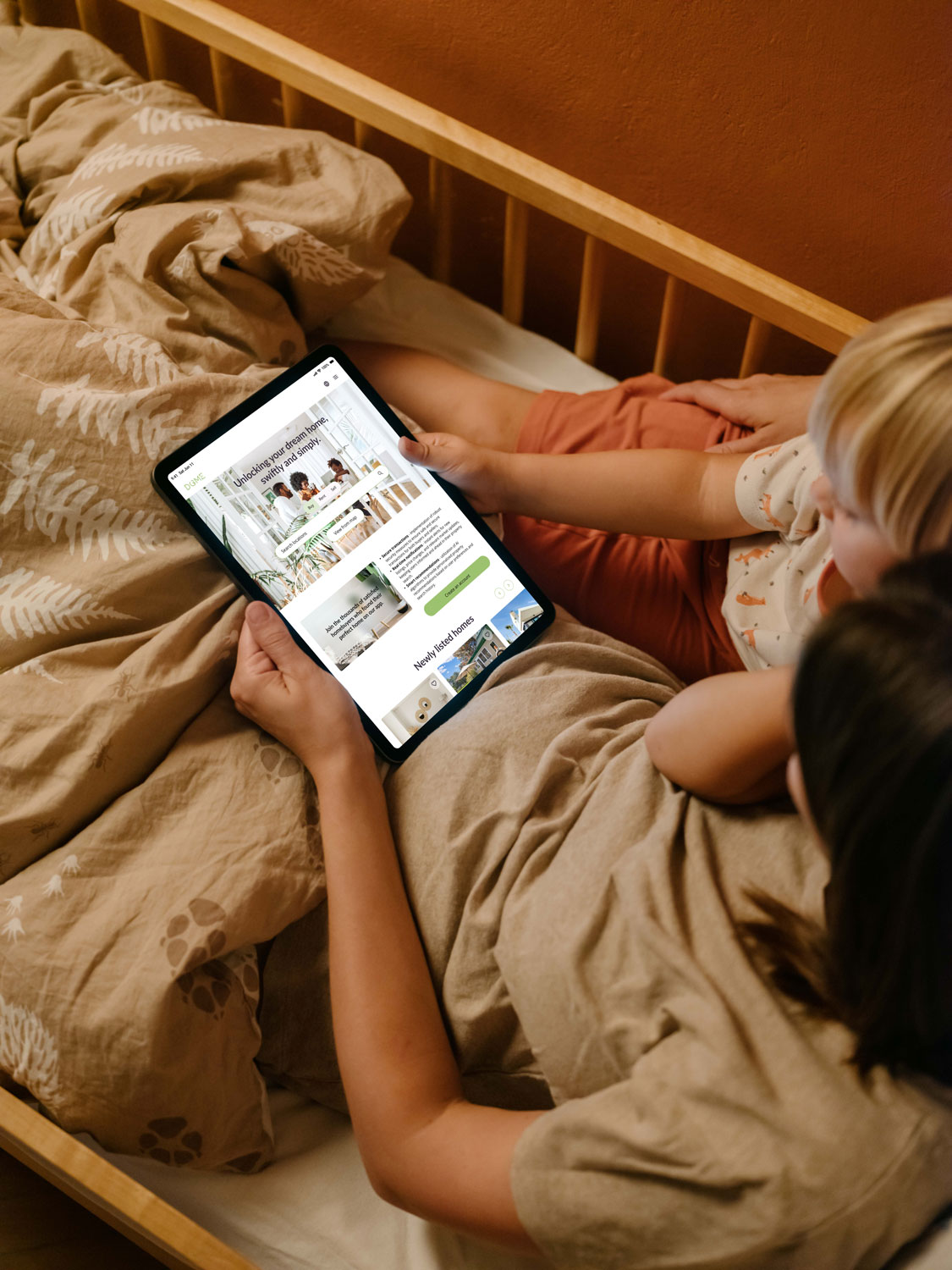
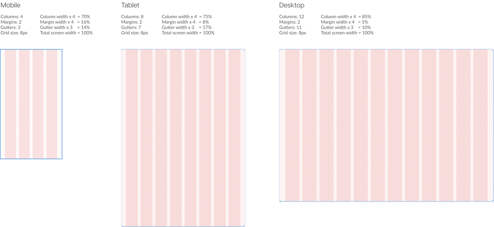
Although the Dome website is built as a mobile-first application to offer consistency throughout the design – medium and large breakpoints were added to ensure intuitive navigation and aesthetical appeal.
Landing page breakpoints
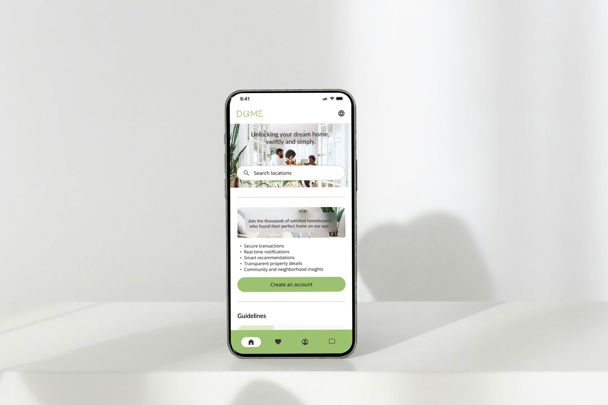
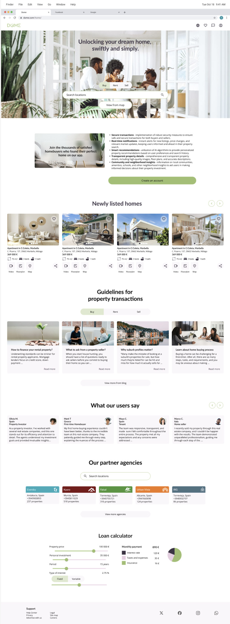
The landing page hierarchy is based on the users’ primary needs for various features.
Medium and large breakpoints also include “Newly listed homes” and a user feedback section. These sections are added to improve users’ long-term engagement with the website and to build trust with potential users through possible feedback forms.


Property details breakpoints
On a medium and large breakpoint agency info will be scrolling together with the rest of the content to offer easy and direct possibilities for users to contact an agent or book a tour.


8. Summary
The following site is built by following a user-centred design process – keeping our brief and our persona as the focal point of all the features. The interface is designed to be accessible and clean, considering the various mandatory WCAG design guidelines in the EU.
The most challenging part was creating the design with limited user experience research. Although the user flows and competitive research was part of the process, the project would benefit from engaging with a wider range of users to understand the scope and the further possibilities of a website and its services. This would also attract various users with different goals and needs.
