Mobile-first website for Safe Place International TDA graduates
Design Leadership | Design System | Brand Guidelines | User Flows | Collaborative Problem Solving
Overview
Safe Place International (SPI) is a global organization dedicated to supporting doubly marginalized communities, primarily refugees identifying as LGBTQIA + and/or single mothers. Through a holistic development programme, the organization provides support, advocacy, and resources for individuals facing crisis situations, such as violence, trafficking, or abouse.
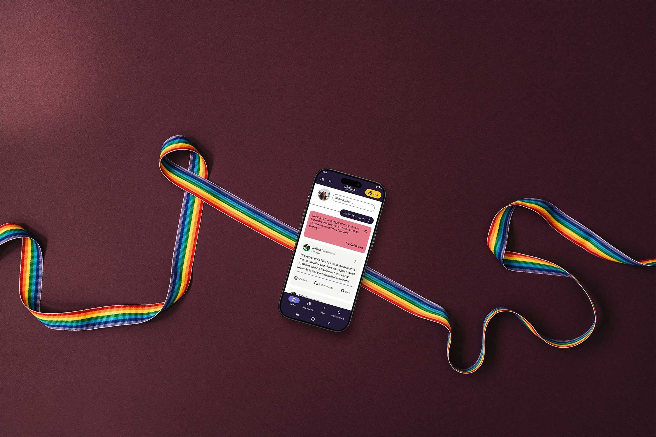
Through their Dream Academy, SPI offers a 10-week leadership training course focusing on leadership development, socio-emotional learning, and job skills training. Our design team’s goal was to continue designing a mobile-first web browser for SPI TDA graduates to keep in contact with each other, participate in community activities, report acts of violence, and get necessary information about various resources (jobs, housing, community, etc.).
My Role
The following designs, displayed in this portfolio, are the result of the whole team’s work. I do not take credit for every design. My main role was to supervise the whole process, during which I also guided the designers through design decisions and troubleshot a variety of problems we encountered.
We had to redesign all of the previous user flows, as the new designs had to follow new brand guidelines. We proposed three different designs with new brand guidelines. Out of the three examples, a client chose my redesigned vision for their new designs. In addition to communicating with the other teams and supervising the process, I also worked on this project as a designer, which is why I was able to understand all of the issues designers faced and troubleshoot them as soon as possible.
Tasks
Design Team Leadership Implementing New Brand Guidelines User Stories & Flows Updating Design System Style Guide Prototyping Icon Design Dev Team Handoff Collaboration with UX Research
Tools
Figma Photoshop Illustrator Rotato Discord Notion
1. Problem
The goal of the project was to create a platform for TDA graduates to connect and share resources and information.
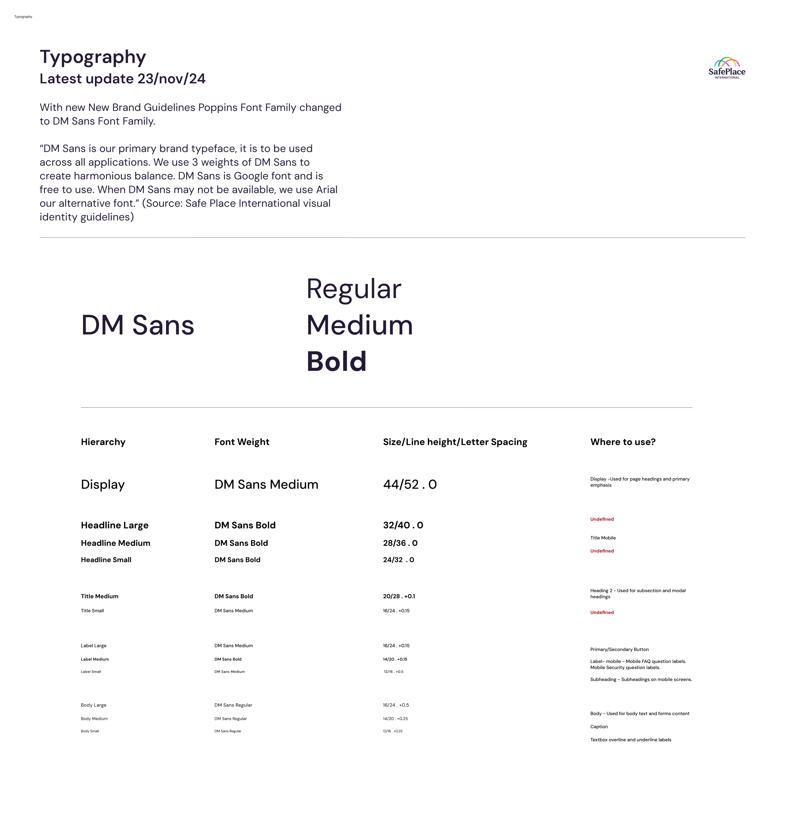
The initial project was paused for 1.5 years. During this time, the client implemented new brand guidelines (logo, colour, typography, patterns) in their organisation’s visuals, and when our team started working, the old designs looked outdated.
During the process, we discovered a lot of issues with the old designs. For example, the design system was unfinished – missing components in a variety of design files and no optimised design built within the components. Also, in the design flows, a lot of basics still had to be implemented – systematic auto-layout, linked instances, and consistent typography, accessibility and design elements.
As a design lead, I also had to create a sustainable workflow for our designers. In our team the biggest issue we had was the difference in time zones. Half of our design team was located in the EU, and the other half was in the US, so we had to navigate within the constraints of different time zones, so we could not have many all-hands meetings.
Solution
As a design co-lead, my first task was to organise all of the Figma files systematically – to have the design system and design files separate. Within the files, we also had to create a seamless and sustainable flow of information – so the designers could understand and find the necessary information and designs (prototypes for the dev team, user flows, priority tasks and their process, etc.)
The project involved a lot of design work from a variety of angles. To be able to understand the scope of the work, we started out by auditing the designs. After this, we were able to update the design system and implement new brand guidelines for mid-fidelity designs. To optimise the workflow, we decided to split our team in half – three designers working on wireframes and three designers on a design system.
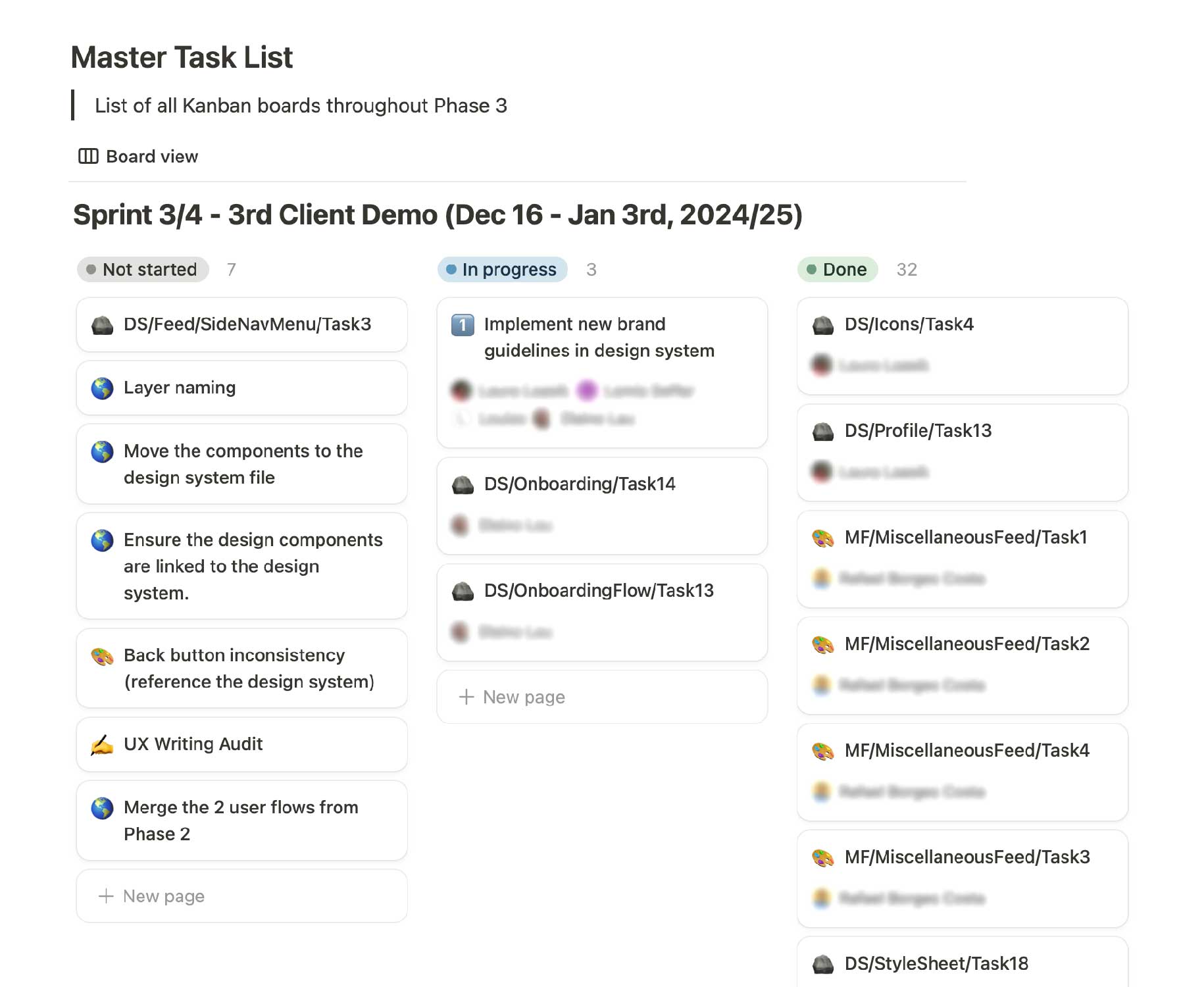
With the Kanban board, daily working sessions and weekly meetings, we managed our sprint goals and were even able to provide prototypes to the dev team.
2. Design System
Overview
The biggest problem we faced at the beginning of the project was the handoff of the project. The main issue was that design system components were scattered in a variety of files and had to be brought together. During this, we discovered that files were oftentimes not linked together and had to be reorganised to create a sustainable project. Also, there were a lot of inconsistencies in the main components and variants, so we had to choose whether we were trying to fix previous components or if it would be less time-consuming to build new components. To streamline the work process, we broke this into a lot of separate tasks in the Kanban board, so we had an overview of the general workflow and also individual tasks
Kanban board sprint goals
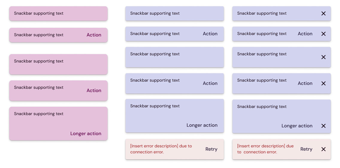
2.1 Style sheets
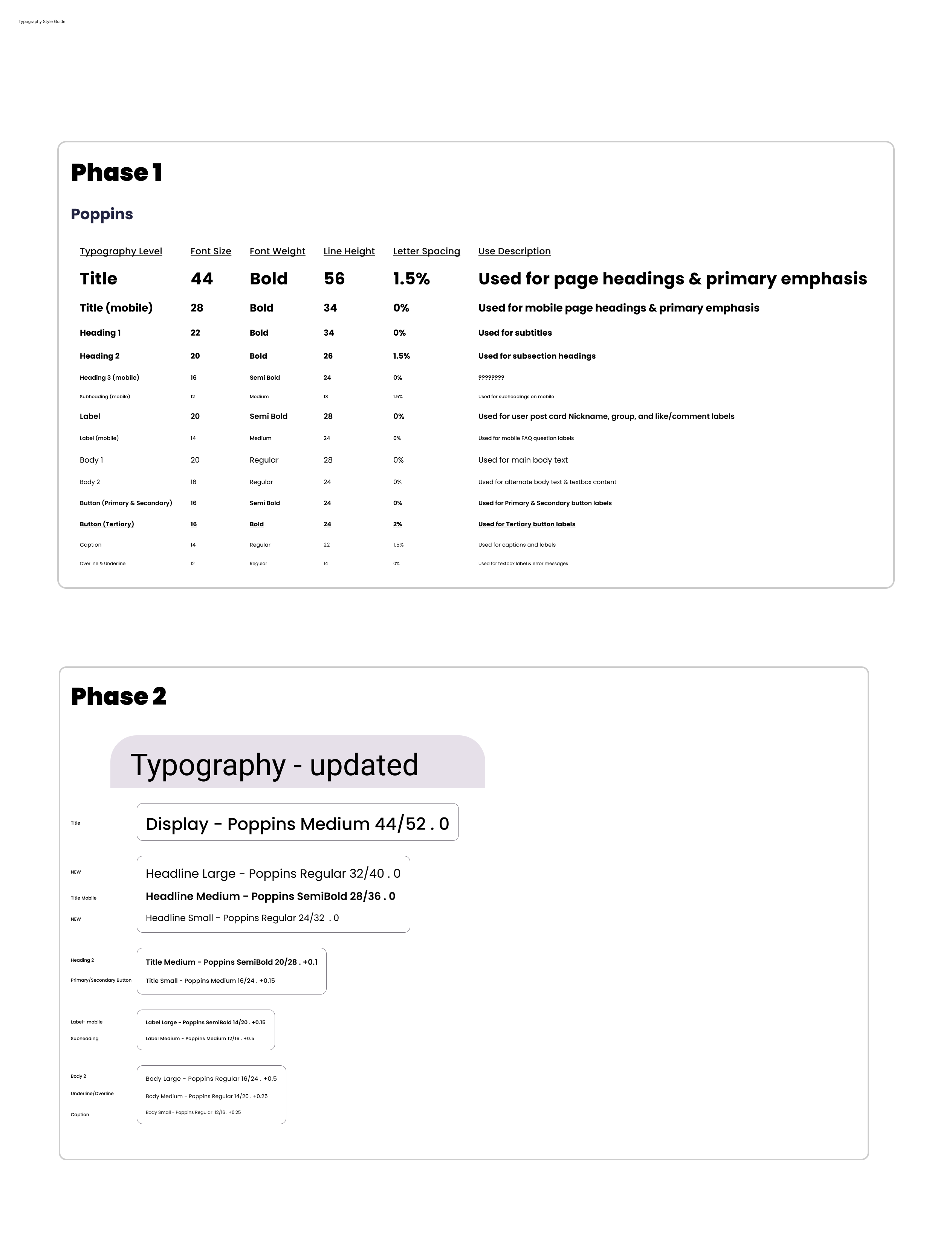
Together with new brand guidelines, we also had to create new style sheets where all of the general recommendations for the usage of the main components could be found. Fortunately, this gave us a chance to create an in-depth style sheet. and we were able to build sustainable and detailed basics.
Typography (Old & New Style Sheets)
Colour Styles (Old & New Style Sheets)
Button Styles (Old & New Style Sheets)
2.2 Design System Components
During these 4 sprints, we redesigned about one-third of the components in a design system library. We chose our design priority based on the product operations team’s user stories, as these were the bases for the developing team to start their work.
Redesigned and Organized Components
Examples of New and Old Components
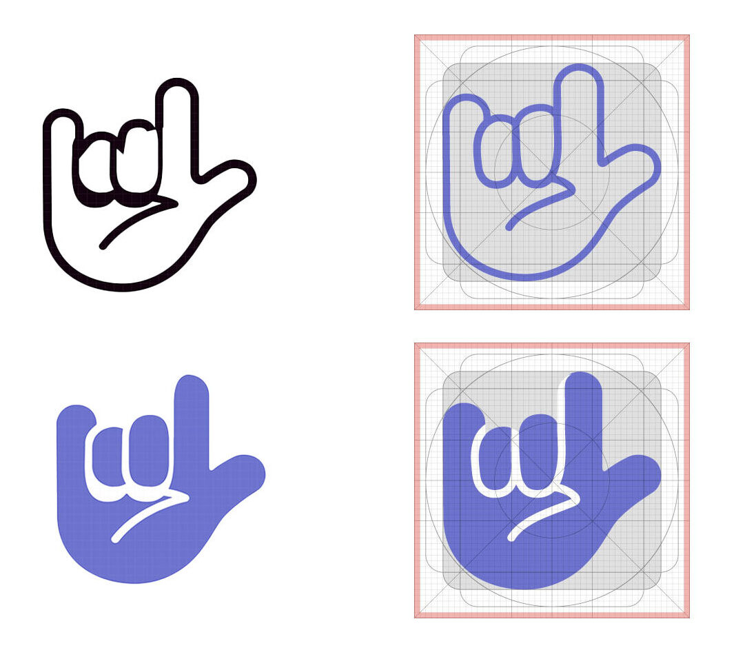
2.3 Icon Design
As the design lead, I needed to ensure visual design consistency, which required me to scrutinize every detail through a designer’s lens. As I noted, the previous designs contained numerous minor details that needed enhancement and correction to establish a cohesive design system.
For example, the previous like button had major design errors in its vector graphics. So I had to clean the lines of an icon and also make it with proper line weight so that it would fit in with the rest of the icons. On the left, you can see the old icon design, and on the right the new design.
3. User Flows
Overview
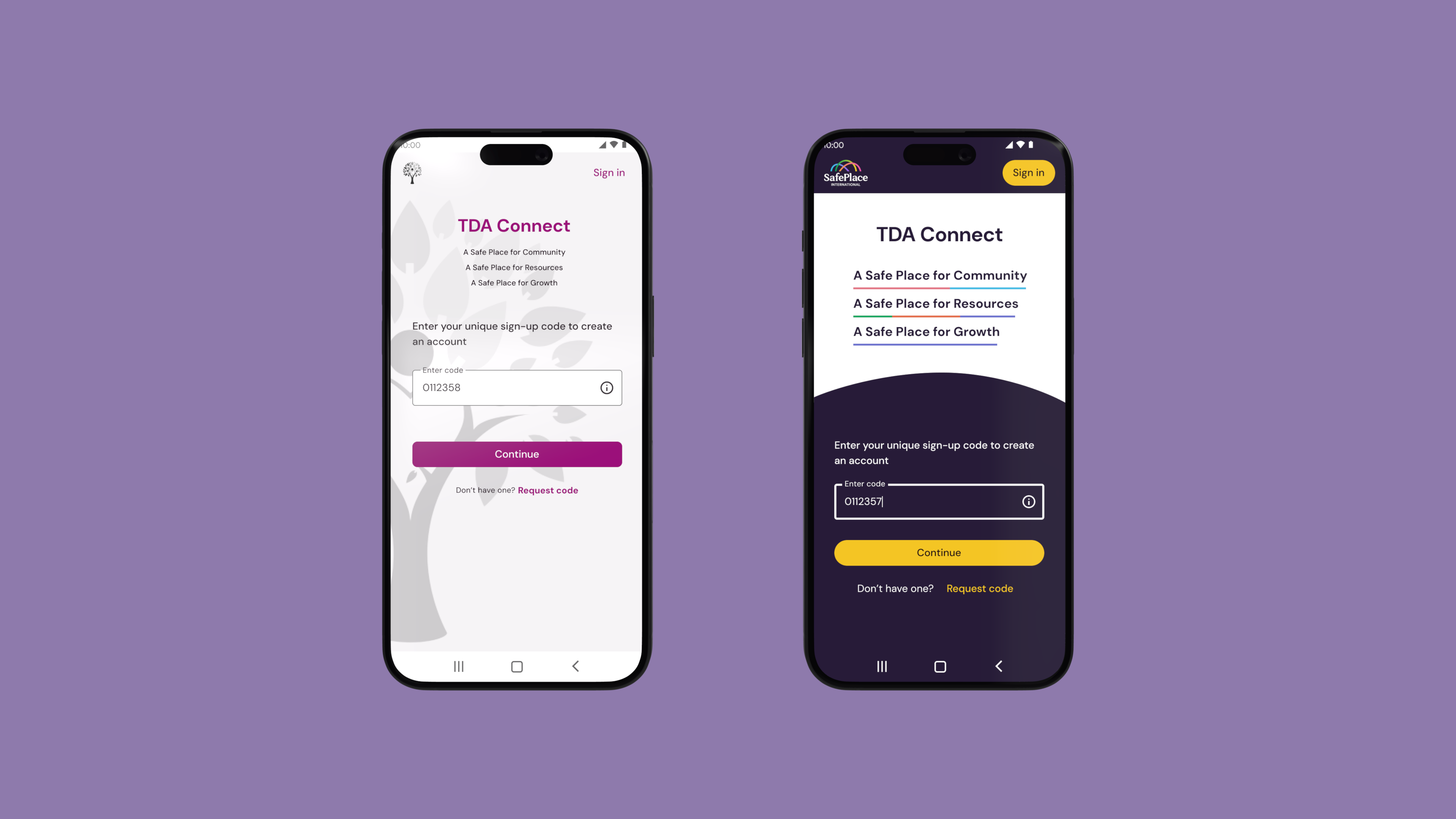
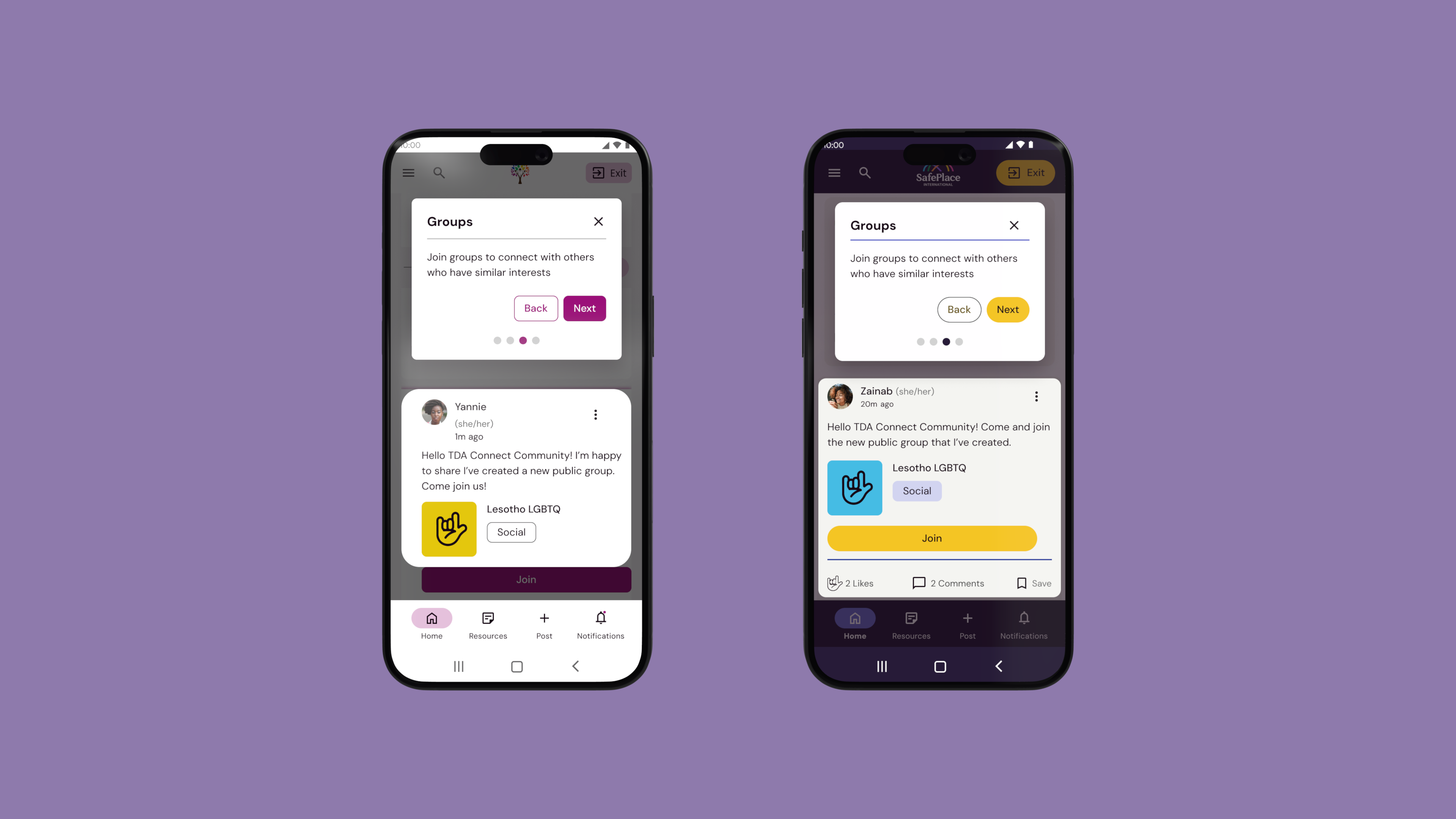
While redesigning the user flows, we had two primary tasks: delivering the initial user flows to the development team and quickly moving forward with redesigning the remaining flows. During the project, we successfully handed off the onboarding and signup flows, which were developed. Additionally, we made significant progress in finalizing the main designs for the Quick Exit feature, profile management, adding a friend, and the settings page.
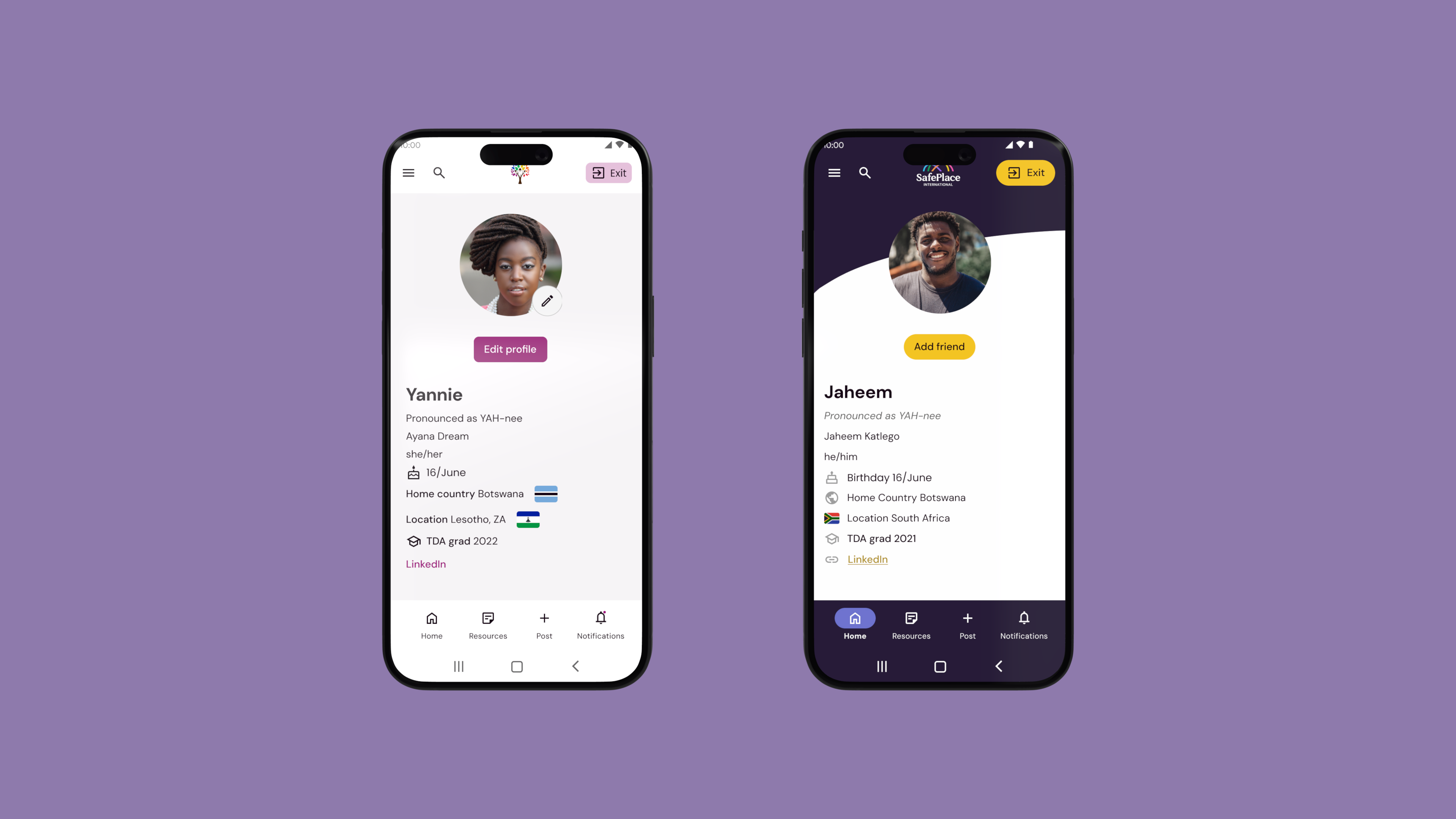
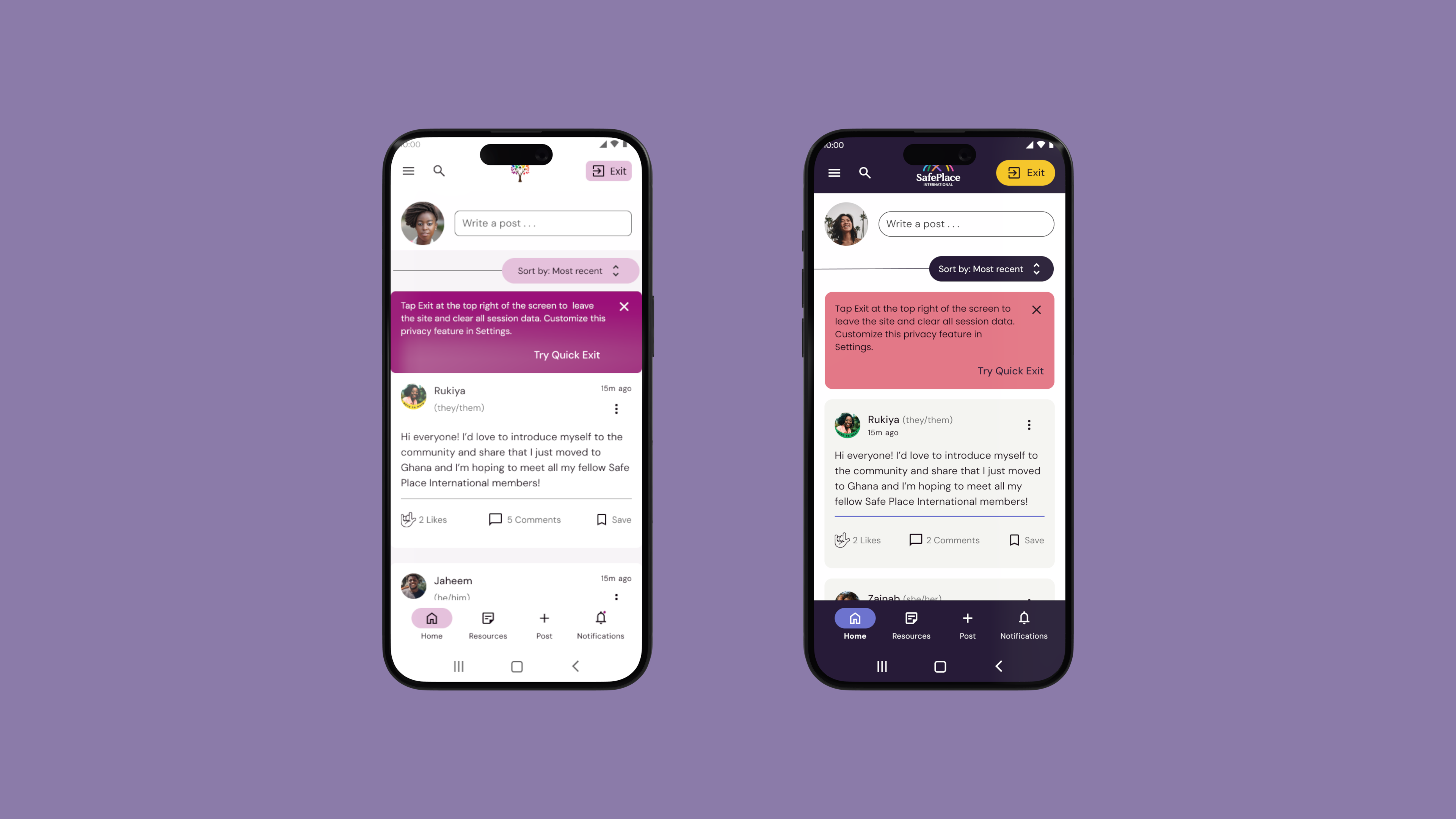
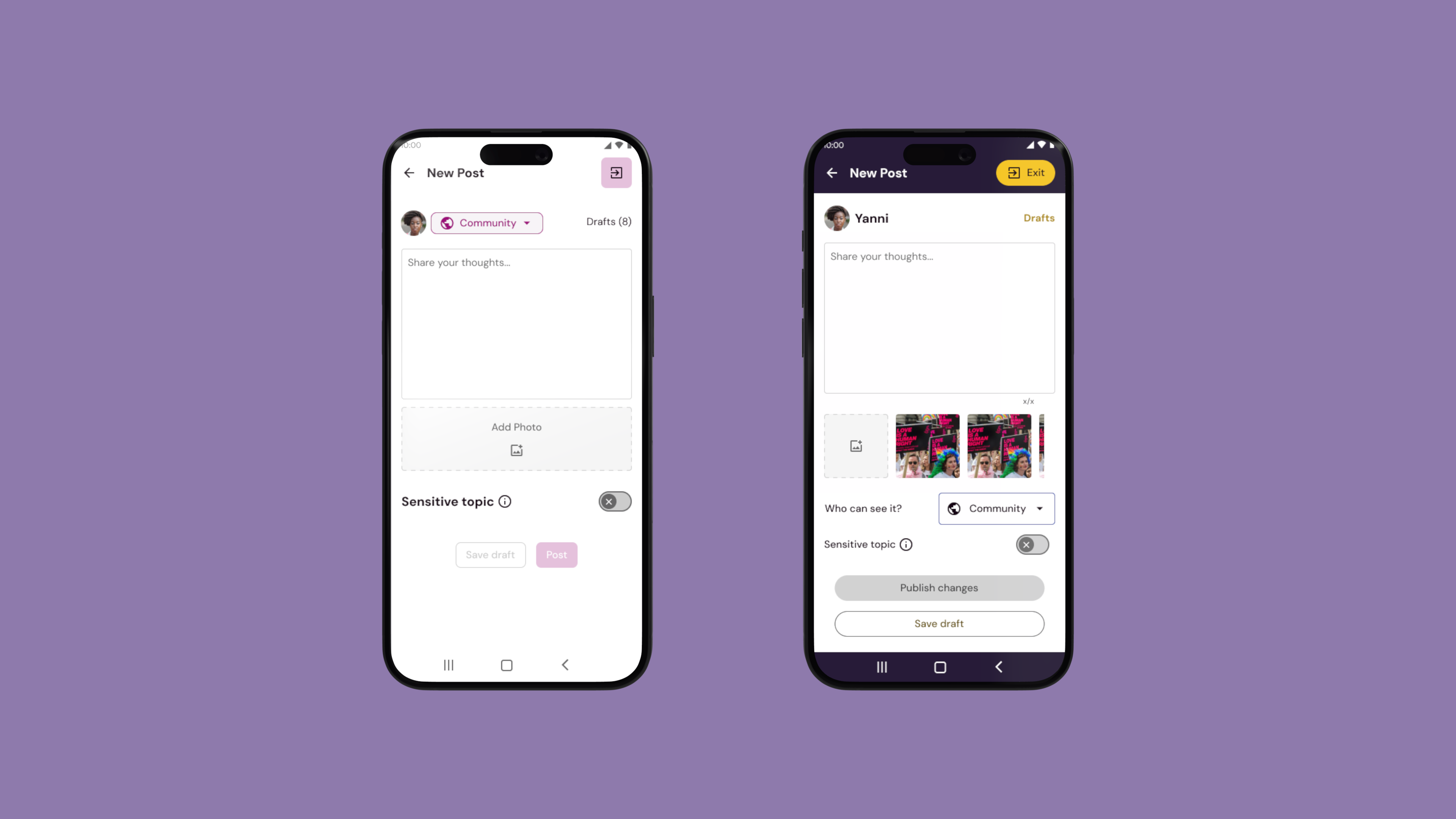
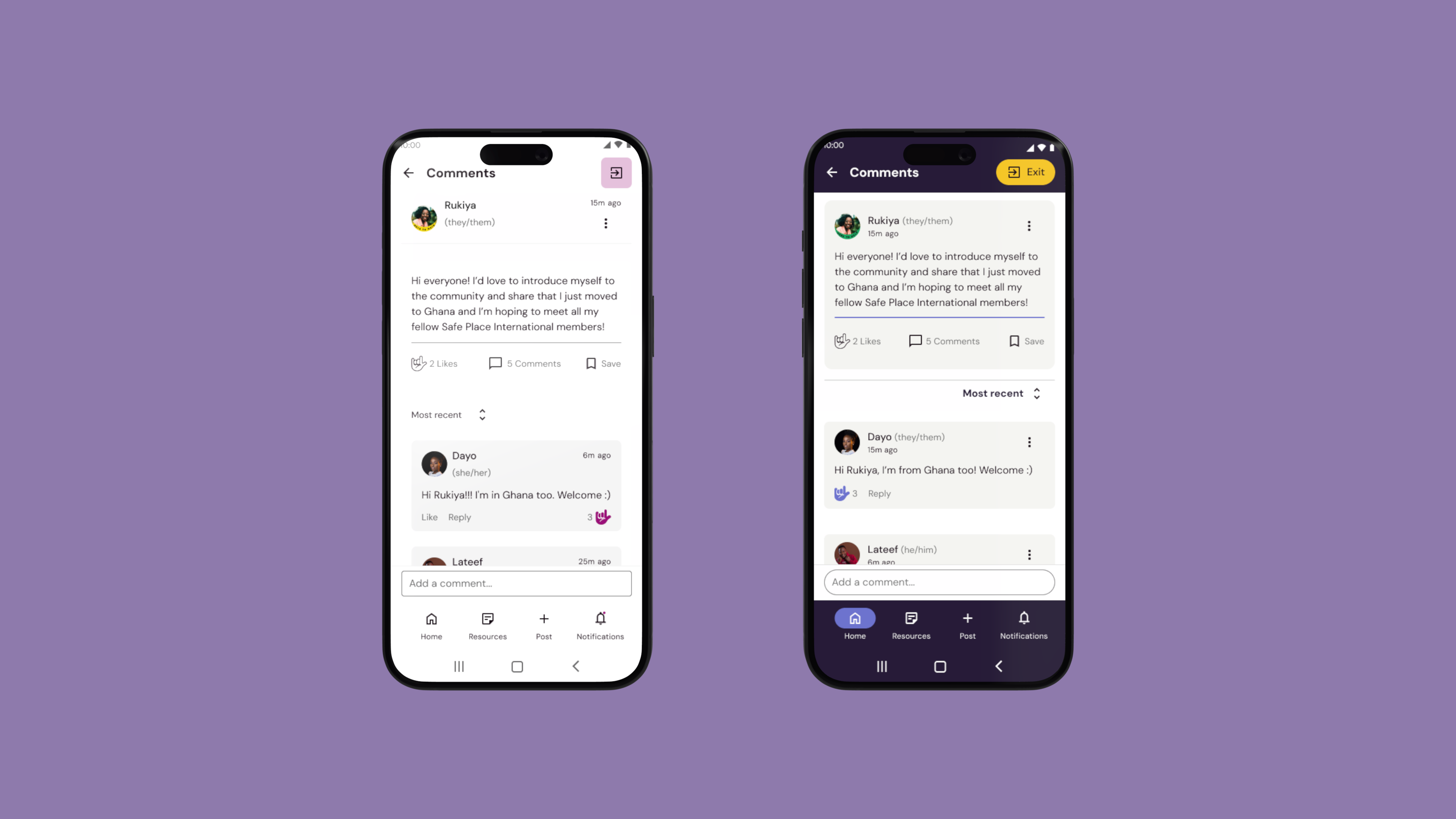
3.1 Redesigned Screens Old & New
Sign up
Onboarding
Profile
Main feed
New post
Comment a post
3.2 Pototype
4. Summary
As the design lead, I collaborated with the team to address the disconnect between their updated brand guidelines and the visual designs used in their previous designs. During this process, I had to ensure that the updated brand guidelines were seamlessly integrated into all design elements while maintaining the essence of Safe Place International’s mission: supporting and empowering LGBTQ+ refugees and asylum seekers.
One of my main challenges as a lead was also ensuring transparent and consistent communication between our teams and the client to meet the project’s timeline.To achieve this, I utilised a variety of platforms and communication methods, keeping everyone updated on the design team’s progress and facilitating immediate feedback to make necessary improvements.
With our design team, our key challenges were :
New brand guidelines: Working closely with the client, we ensured that their updated brand guidelines were effectively implemented across all design elements, reinforcing the organization’s identity and values.
Design system redesign: We revamped the design system to reflect the new brand guidelines, creating a consistent framework for typography, colour schemes, imagery, and iconography across all platforms.
User flow redesign: We restructured the user flows on the website, focusing on accessibility and intuitive navigation to enhance the experience for the community.
The project delivered a first set of user flows to the dev team and refreshed visual designs that faithfully adhered to the client’s new brand guidelines. These updates enhanced the user experience, created visual consistency, and strengthened the organisation’s ability to communicate its missioneffectively.
")
")