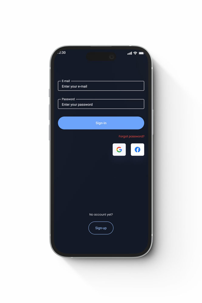
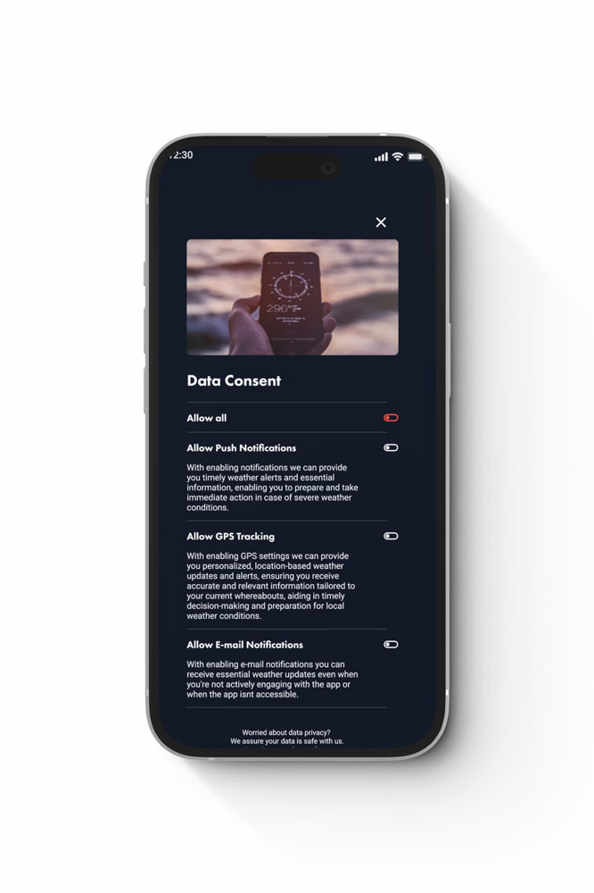
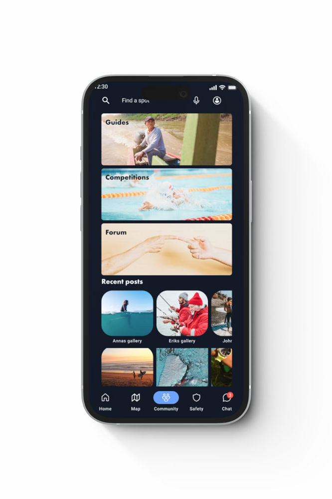
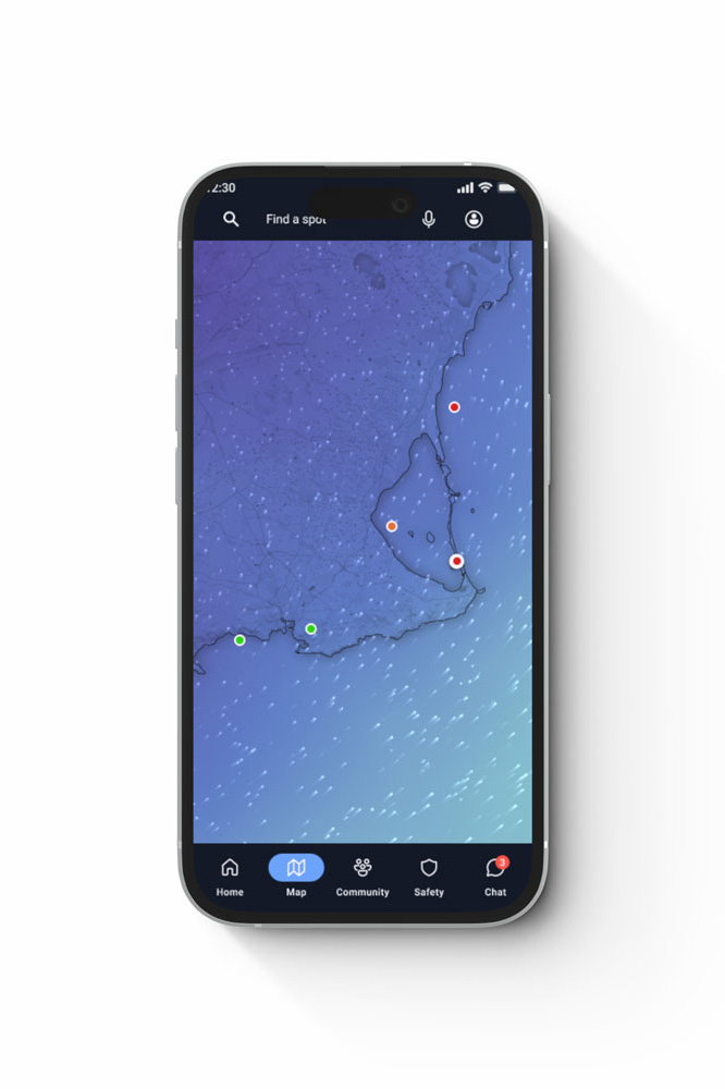
End-to-end design for mobile-first weather application
Discovery | User Navigation | Visual Design | Animation
Water sports aficionados use various platforms and applications to gather the necessary information about the weather conditions, safety and the community before going on the waters. This time-consuming process lowers the quality of the experience and in the worst-case scenario, could result in life-threatening situations when skipping the vital steps to establish one’s safety requirements.
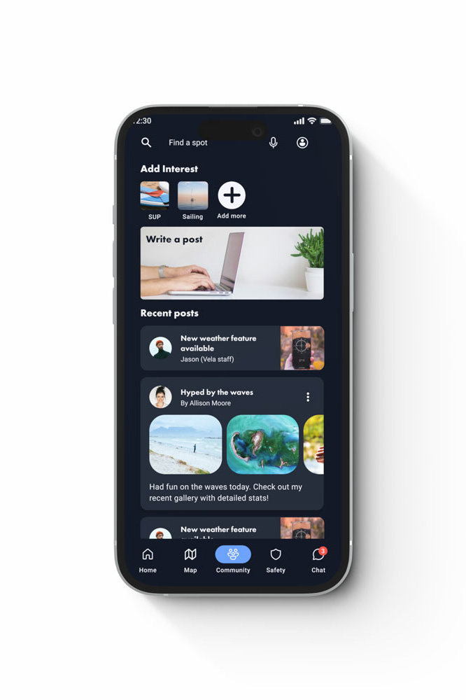
Vela fills this gap in the market by providing all of these features in one application. An application displays complex weather data in an easy-to-comprehend manner and has additional safety and community features to cater to the main needs of a user.
Tasks
Market Research
User Interviews
Card Sorting & Sitemaps
User Flows & Journeys
Affinity maps
Usability Testing
A/B Testing
Visual Identity
Tools
Figma
Photoshop
Illustrator
Rotato
Lyssna
OptimalSort
Process overview

1. Problem
Water sports enthusiasts need a way to see the real-time weather data on the water and to do it in the safest possible way, because incomplete information about the weather conditions or overestimating one’s skills, might lead to poor or even dangerous experiences on the water.
Solution
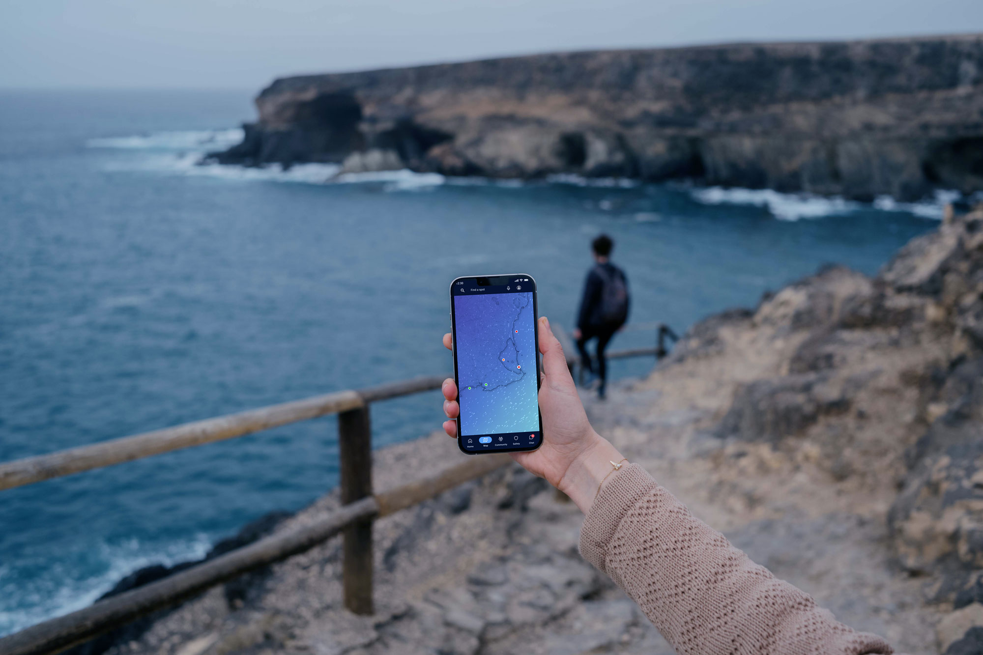
A weather app synced with real-time weather data, which offers the possibility for users to connect with fellow sports aficionados.
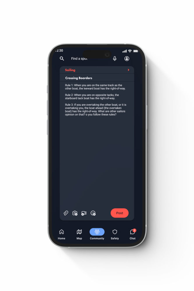
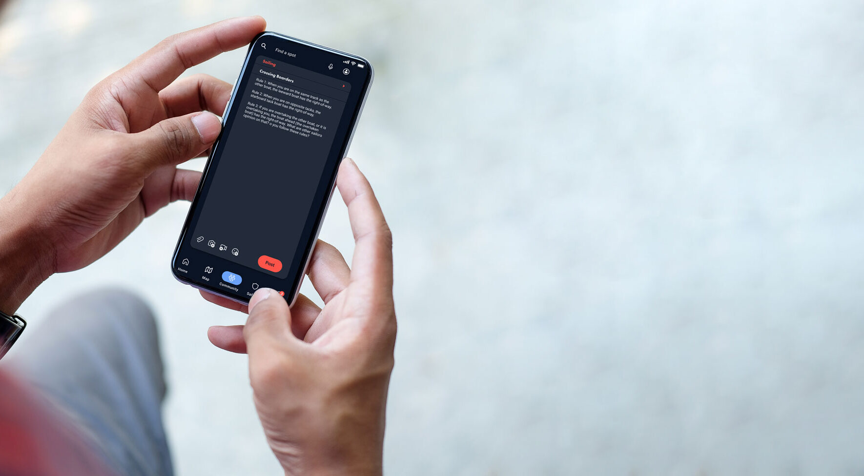
With the integrated community feature users have a possibility to share and track their upcoming routes and find a buddy to go on the waters together, which eventually increases the safety of the users. It also provides a possibility to connect with fellow sports enthusiasts through in-app competitions and tours.
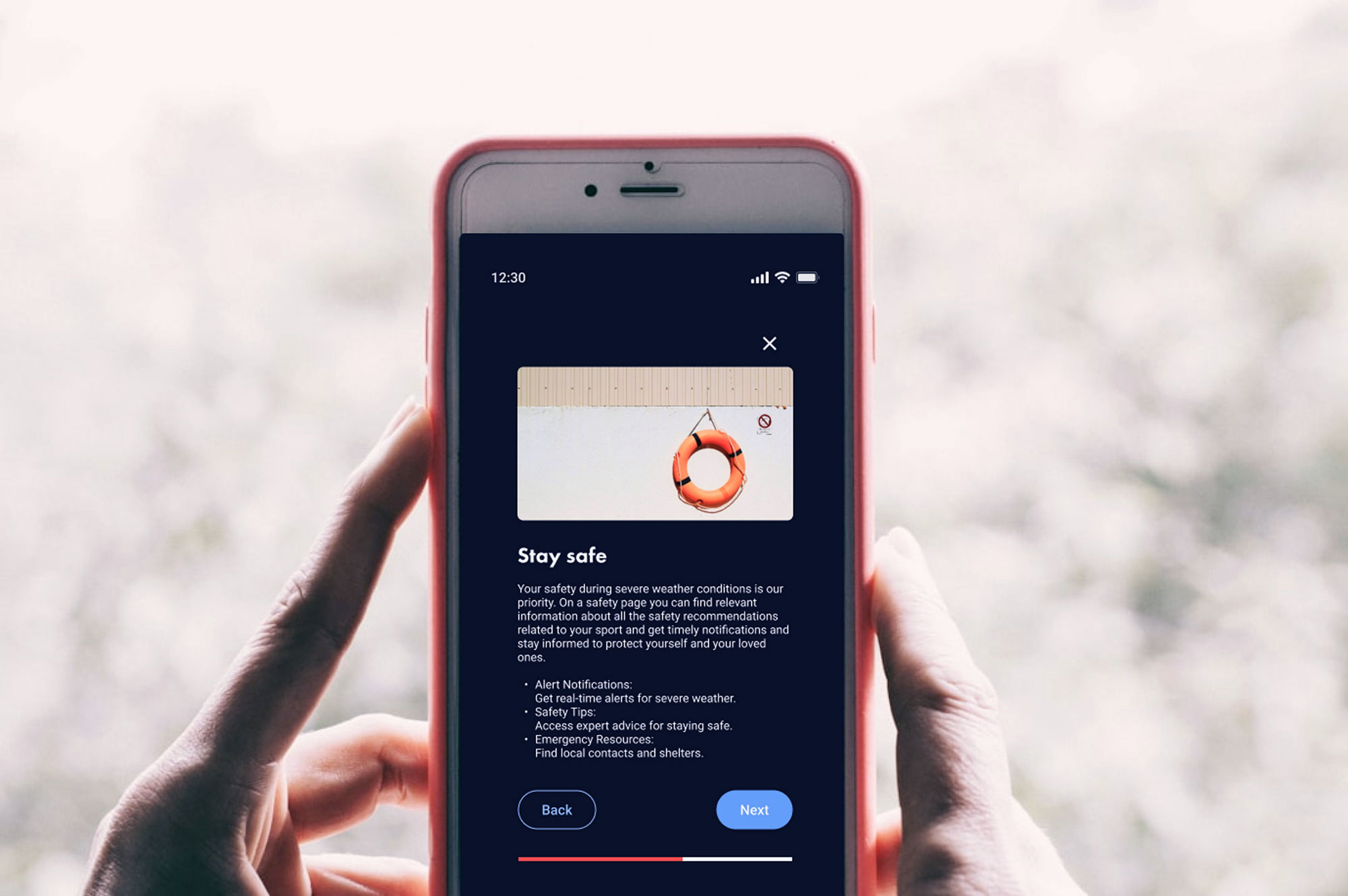
The app also has a safety feature, which provides security alerts about sudden weather changes, safety tips for various sports, and a possibility to contact local sea rescue about their trips as a precaution.
2. Market research & competitive analysis
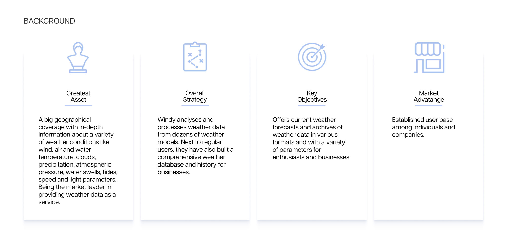
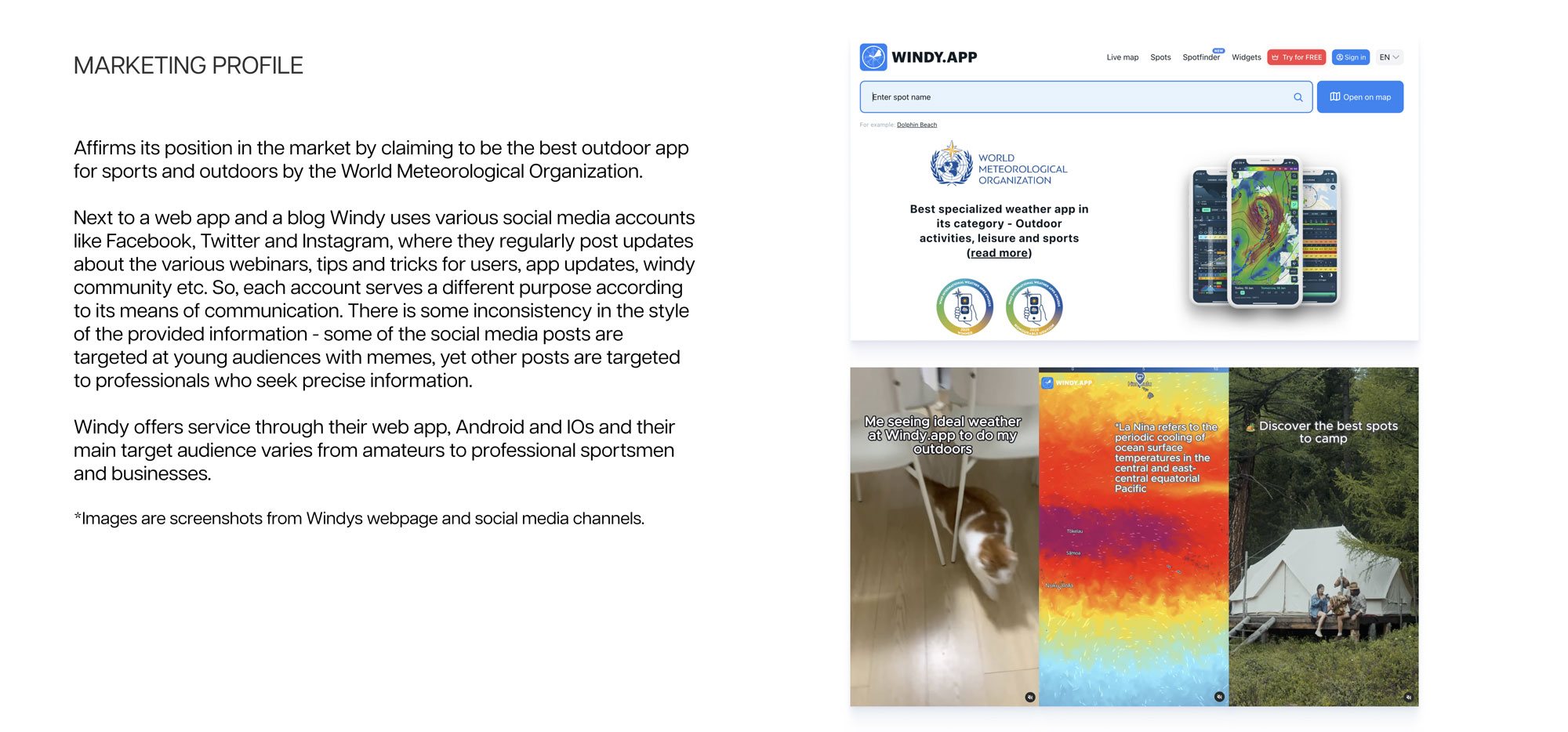
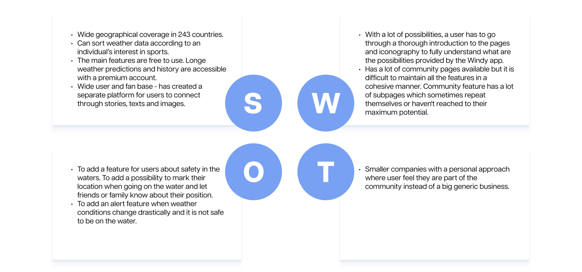
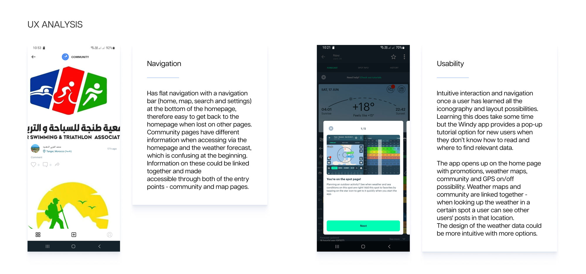
I analysed 3 competitive companies (Windy, Surfline and Surf Captain) and defined their overall strategy, market advantage, key objectives, marketing profile, SWOT and UX structure.
I was able to pinpoint each of these companies’ distinctive features they were successful in or what they were lacking – detailed infographics, community blog, and in-depth weather analysis.
The key takeaway from this analysis was that the success of the app is not defined by the accurate weather forecast, as it is impossible to achieve, but rather through the additional features. These features will also keep a user engaged with an app when they meet user needs and wants.
View a fragment of Windys analysis on the following slides.
3. Defining users needs and problems
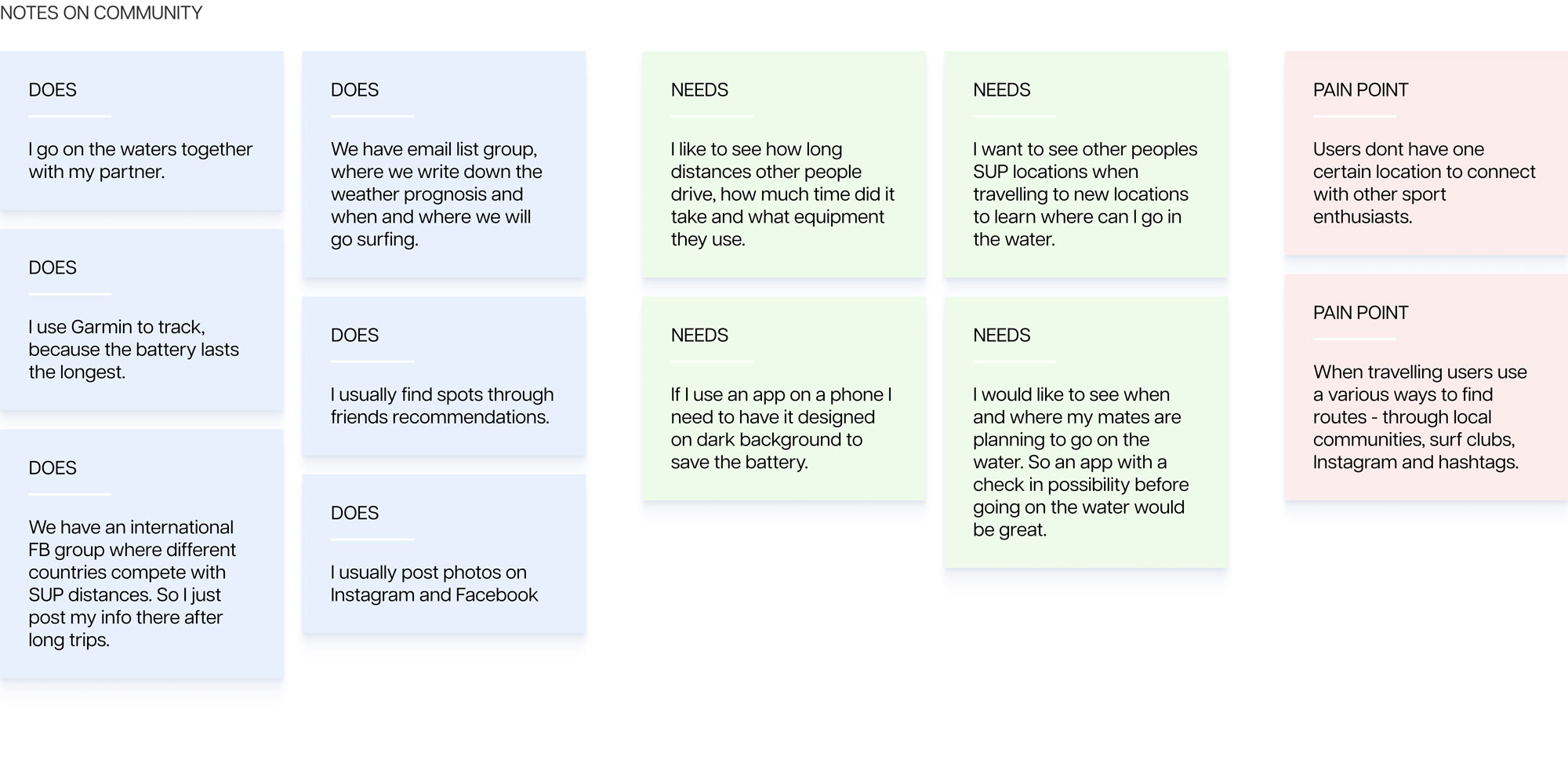
To understand users’ needs, goals and motivations, I conducted user interviews with potential users. All interviewees were related to various water sports on different skill levels – from beginner to expert. Because of their diverse demographics, I was able to identify several features they are missing in their experience right now.
For example, all of the interviewees highly valued the community around them, but asking friends to join their trip through Facebook or WhatsApp was always an extra step they had to take before going on the waters. For example, this need for a connection could be solved by integrating a simple pinning system on a map, where users can set the time, location and visibility of their trip for other users and friends to join.
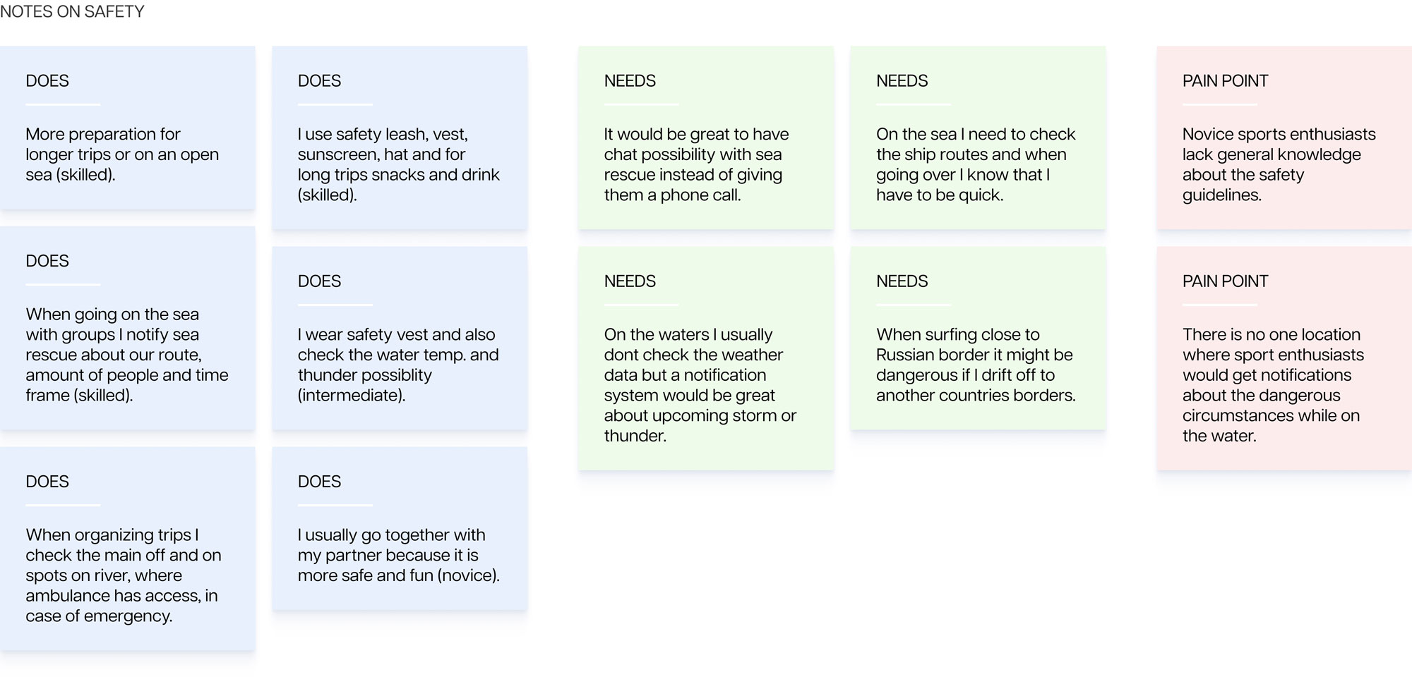
Or, when going on the water with a group, they had to notify the sea rescue by phone about the trip, which was a time-consuming and annoying task to do. This could be solved by a simple messaging system, where a user can send a template message to the sea rescue with the details of their trip.
Affinity maps
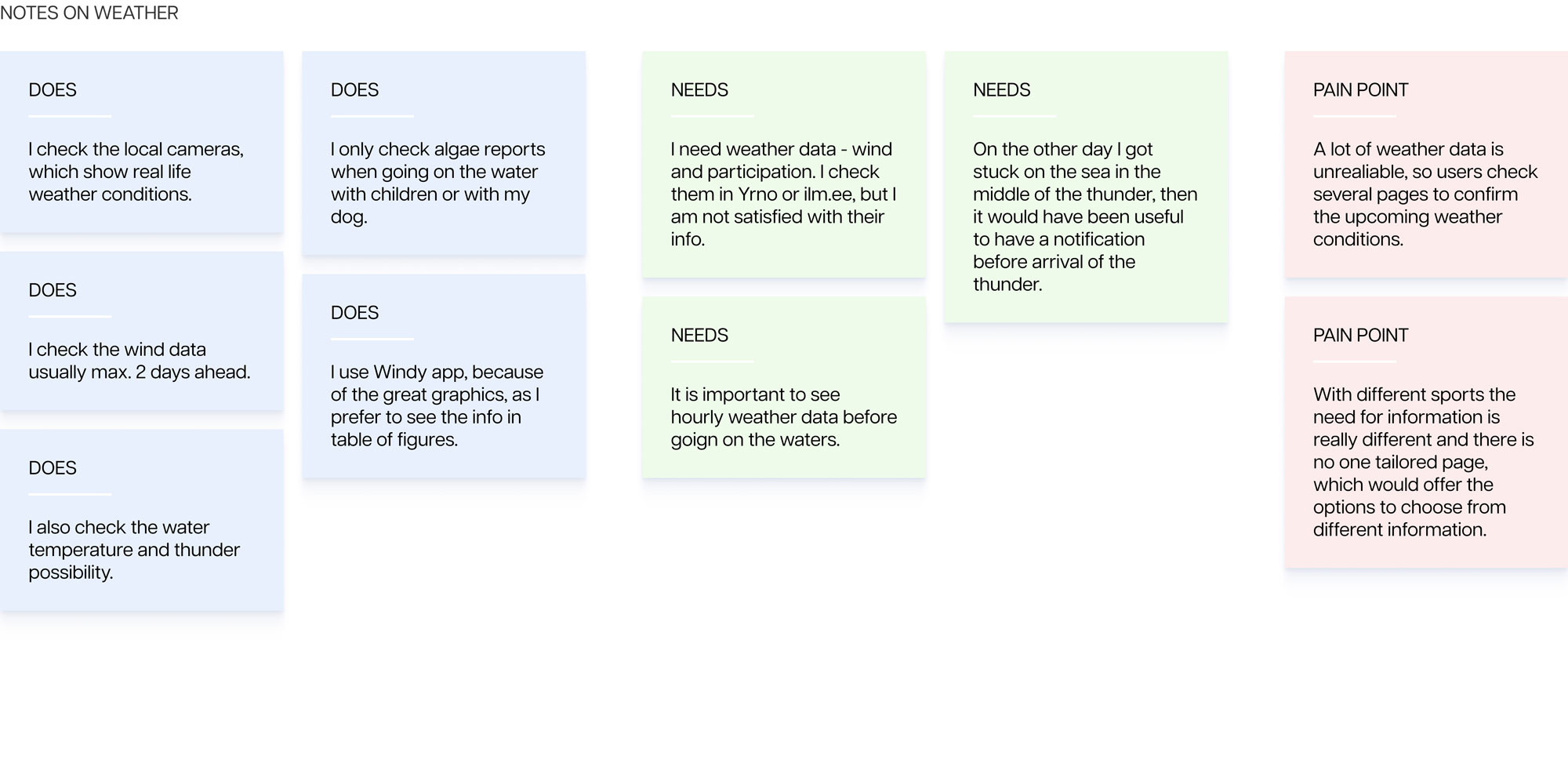
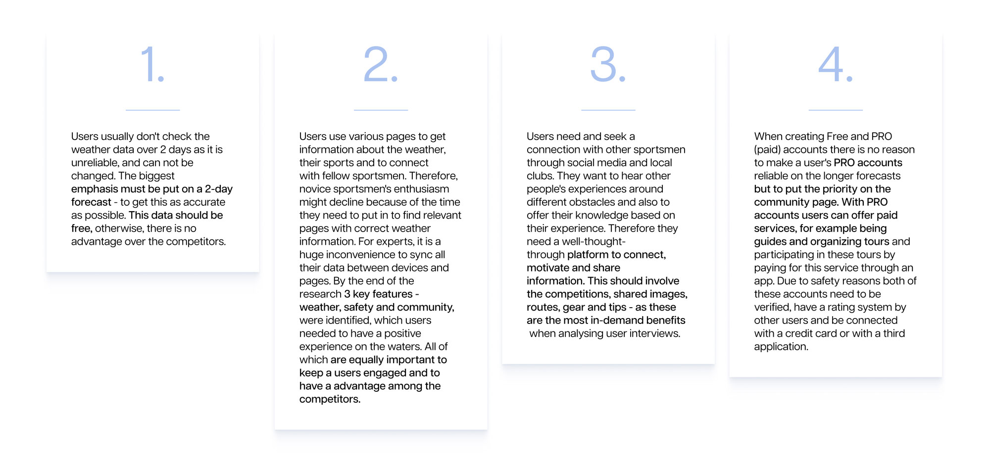
After transcribing the interviews I was able to create affinity maps based on the 3 key topics.
User insights
Personas
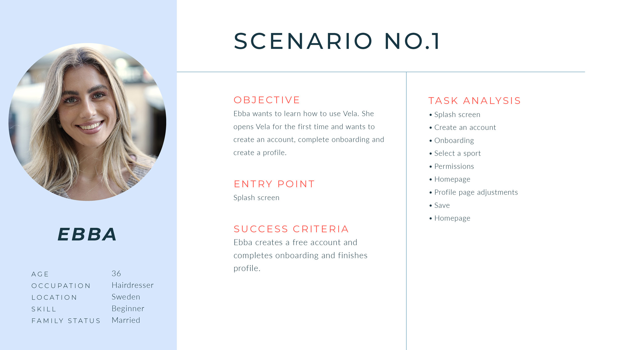
Based on the user interviews, insights and affinity maps I crafted 3 personas, whose backgrounds represent 3 diverse groups of users of an app. They vary in experience, sport, age, ethnicity and tech savviness. These personas were a base to create a variety of user flows to draft down all of the possible frustrations and journeys a user might take.
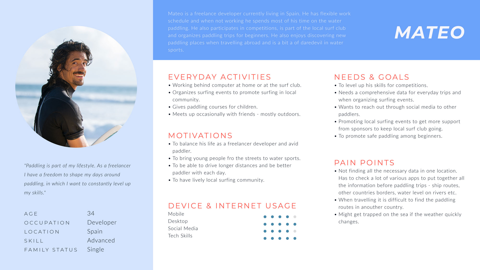
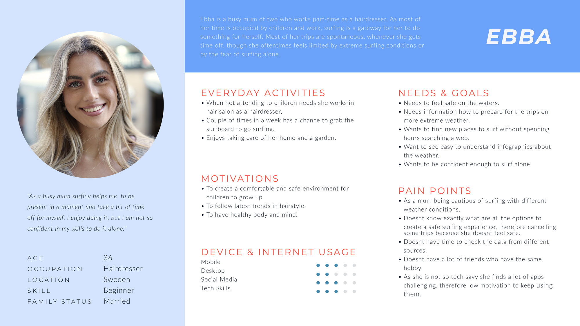
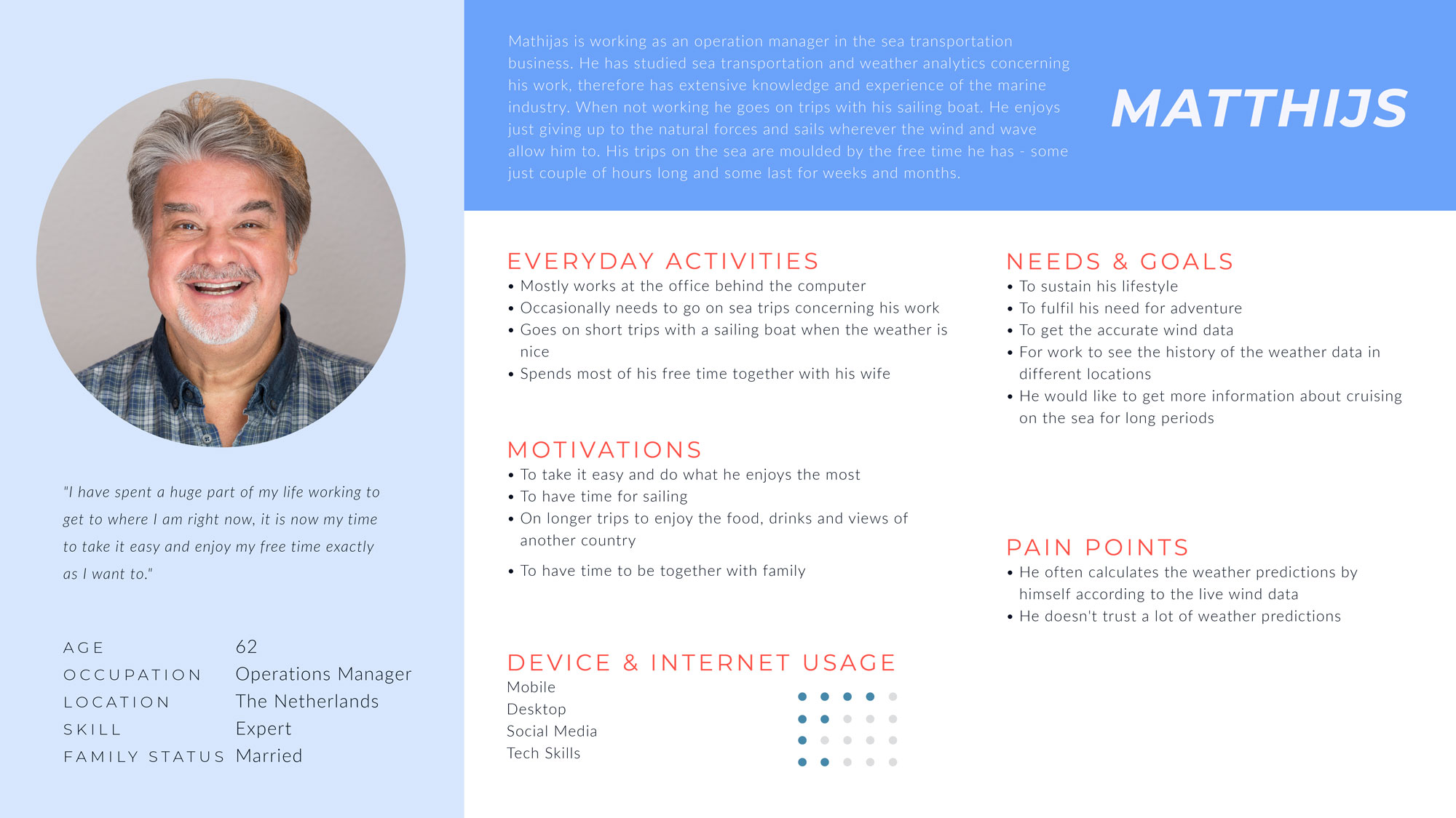
User journeys & flows
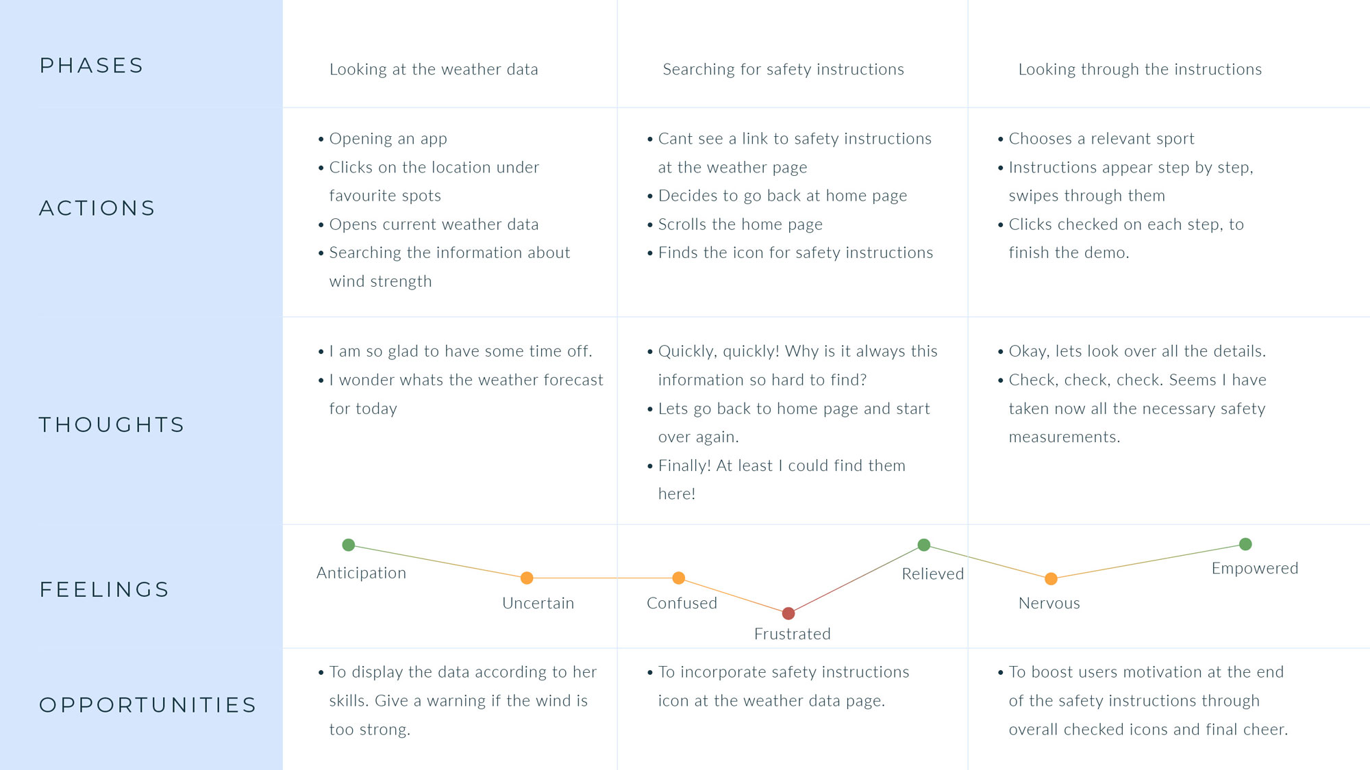
Creating a variety of user journeys and flows helped to identify a couple of dead ends a user could have encountered while navigating in an app and ensured an intuitive journey that aligned with user expectations and needs.
Below you can view a couple of Ebbas scenarios – what kind of key objectives and possible errors she could encounter.
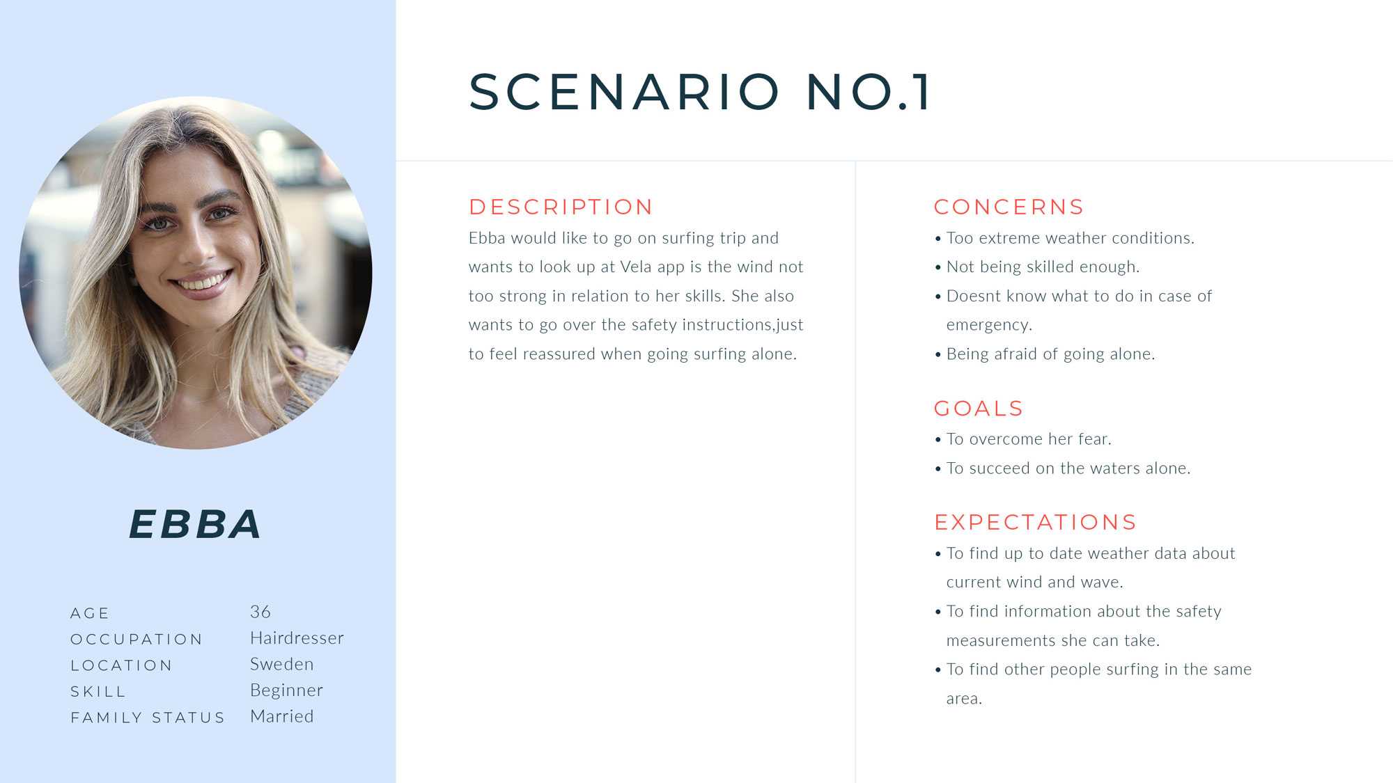
4. Building an IA
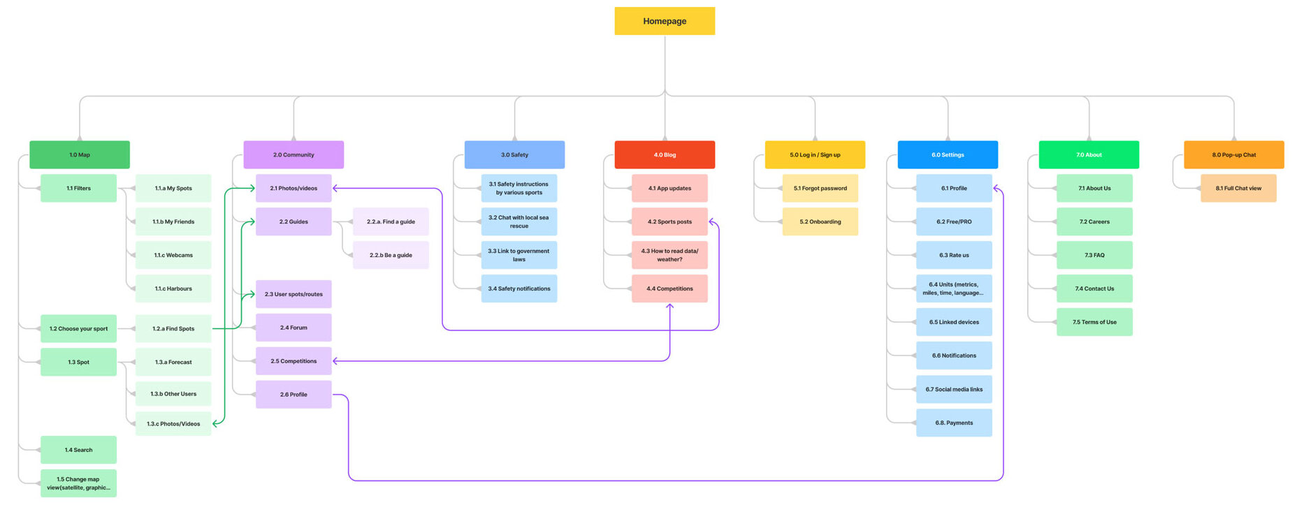
After defining the key problems and main user flows, I began with the information architecture, during which I established the basic navigational hierarchy of an app.
Card sorting & sitemap
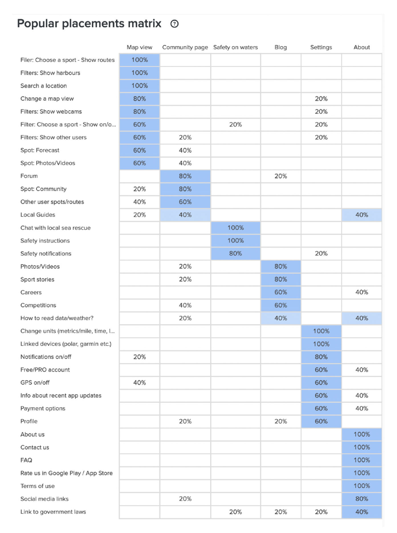
To test my designed hierarchy I conducted card sorting through OptimalSort and redesigned the initial sitemap. While there were some smaller errors within the placement of the cards, all of the potential users did understand the functions and the possibilities of the main features.
Compared to the initial sitemap I narrowed down the amount of content and created additional connections between the main features to create a seamless navigational experience.
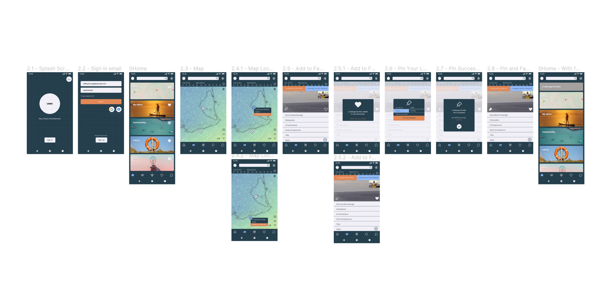
Rapid wireframing & prototyping
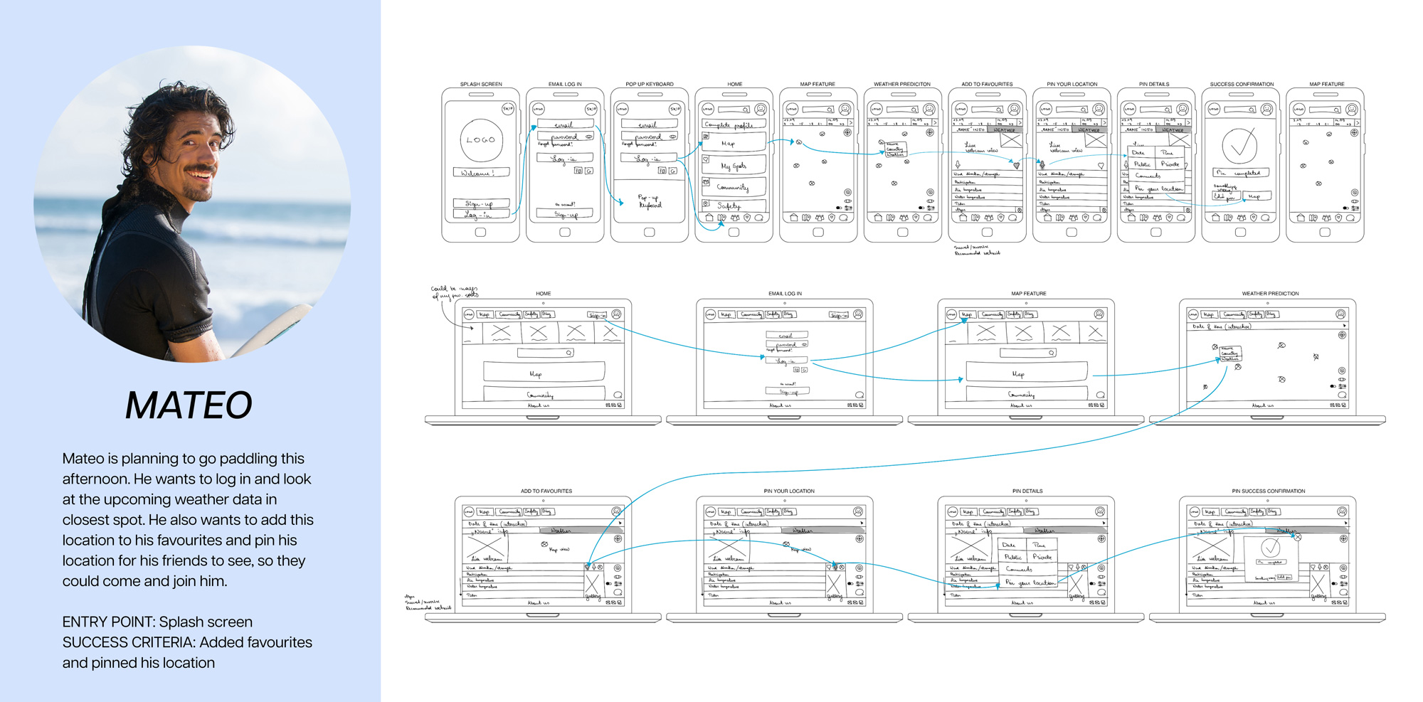
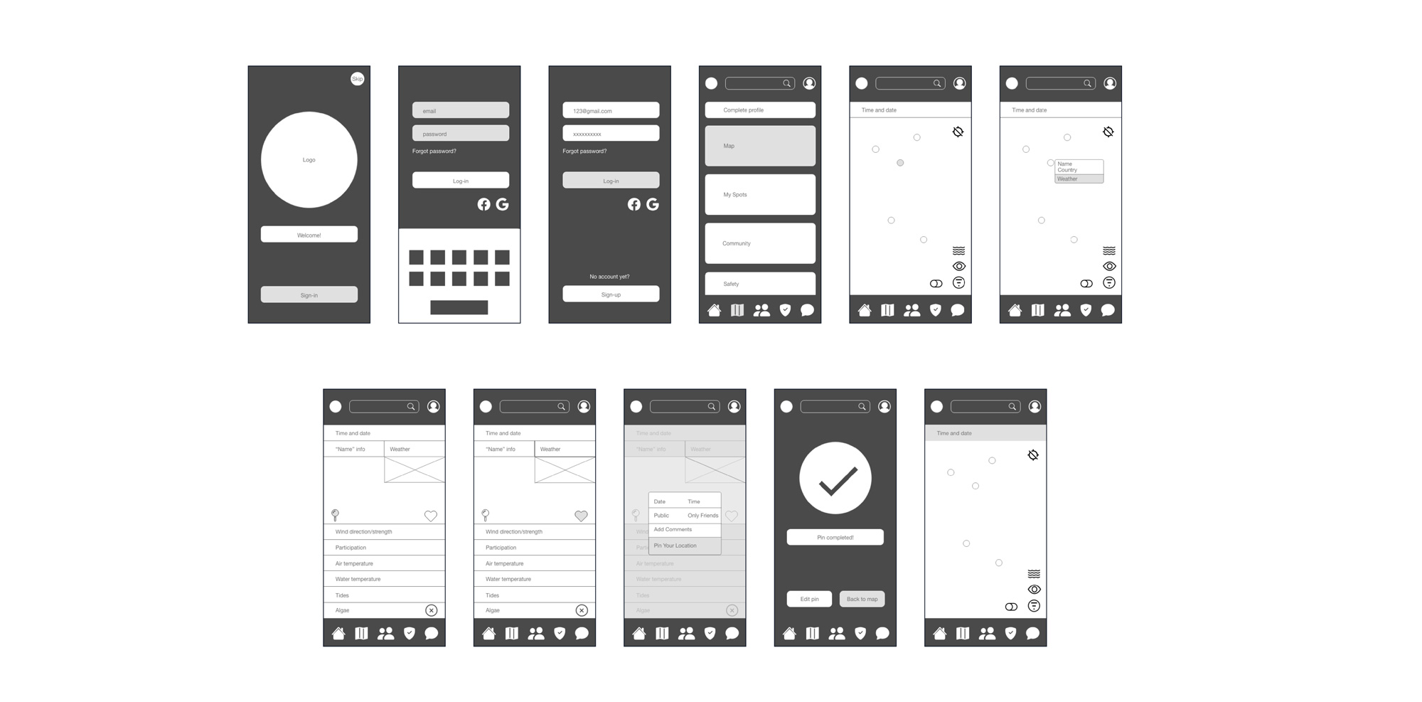
Rapid wireframing helped to focus on the fundamental layout and interactions and provided a visual blueprint to outline the structure and functionality of Vela. With each iteration, I reduced the amount of unnecessary interactions and refined all the elements from the biggest to the smallest of the details.
Below you can view some examples from three different stages of the wireframes.
5. Usability Tests
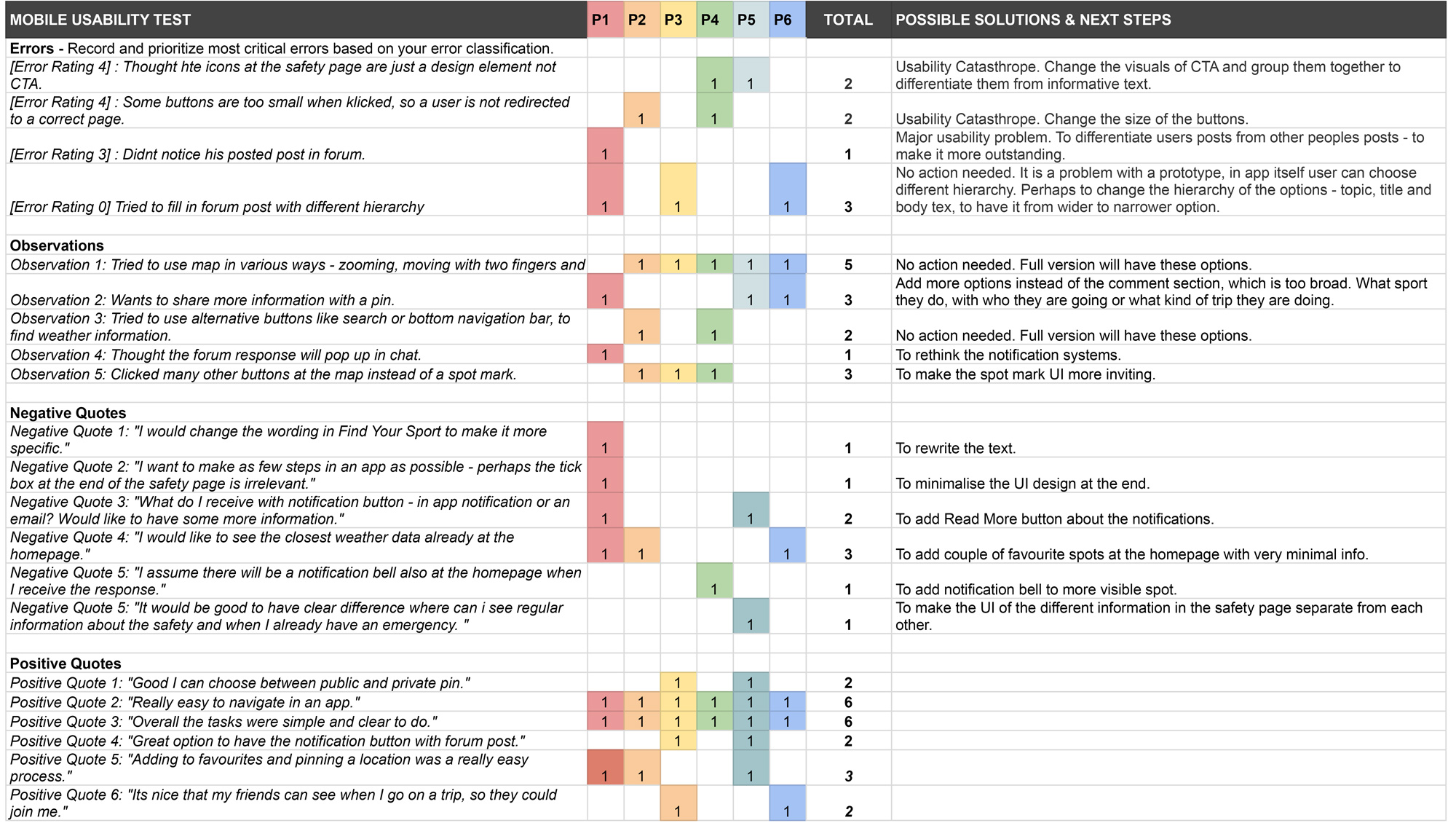
With an interactive prototype, I conducted in-person and moderate usability tests to see how a user navigates within the main features and A/B tests to define the hierarchy of the homepage.
With this, I assessed the learnability, efficiency, and error rate of the main interactions and features that a user might use with an app. While using the Jakob Nielsen error severity scale I defined the key errors, observations and quotes, based on which I was able to redesign some of the elements and the structure of an app.
For example, it helped to clarify the distinctions between the primary, secondary and tertiary buttons or to rethink the content of the push notifications. Perhaps an email notification would be more suitable if it is not the case of an emergency?
Methodology
Test type: Moderated in-person and remote
Tested version: Mobile
Participants: 6
Evaluation metrics: Jakob Nielsen error severity rating scale
Participants were allowed to take part in their choice of environment through mobile phones. To be able to evaluate the information later on, the participants’ actions were recorded through screen sharing. Throughout the test, participants were continuously interviewed about the task completion.

6. Visual identity
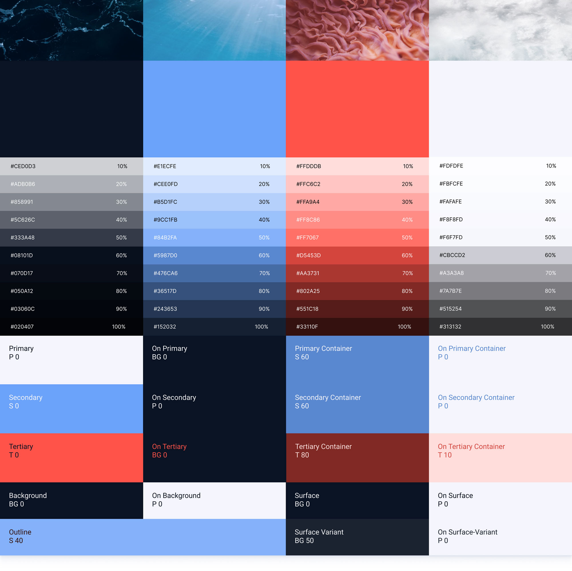
Velas mission is to make weather information an integral and seamless part of people’s daily routines and to foster a greater understanding and appreciation for the nature around us. Therefore my three keywords for creating a visual identity were – strength, fluidity and naturalism.
I was fortunate, that I had the possibility to conduct user tests and interviews throughout the project, which also helped to incorporate various visual ideas users need into a design.
For example one of the problems users were struggling with was, that when they were on long trips they always had to calculate how much they could use their phone and for what, because of short battery life. Therefore they need to have an app which won’t drain the battery, otherwise they cannot use it during long trips on the water. Based on this feedback it is logical to create a main design in dark colours as it is the most efficient choice to make.
Logo
Velas’ identity is designed to be a harmonious combination of strength and fluidity of natural forces. As an inspiration source, I took elements from nature – the force of the waves and the colours of the sea and translated them into Velas’ visuals through colour combinations and logo design. Velas’ visual identity aims to create a trustworthy and memorable connection with the audience while remaining vibrant and fun through small details.


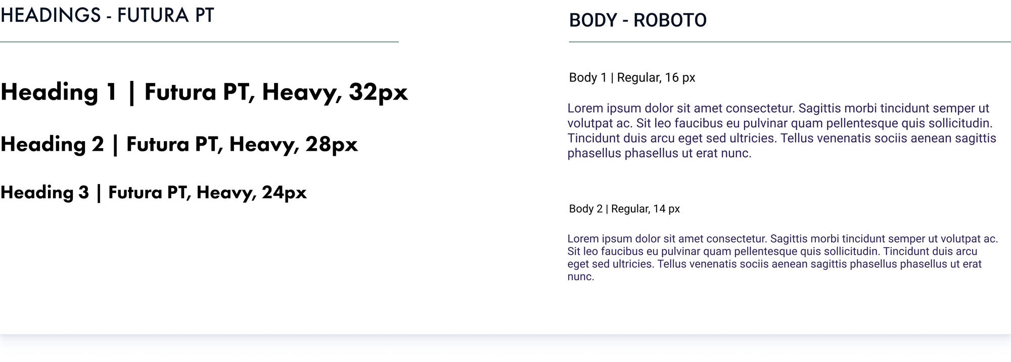
Colours & typography

Basic UI elements

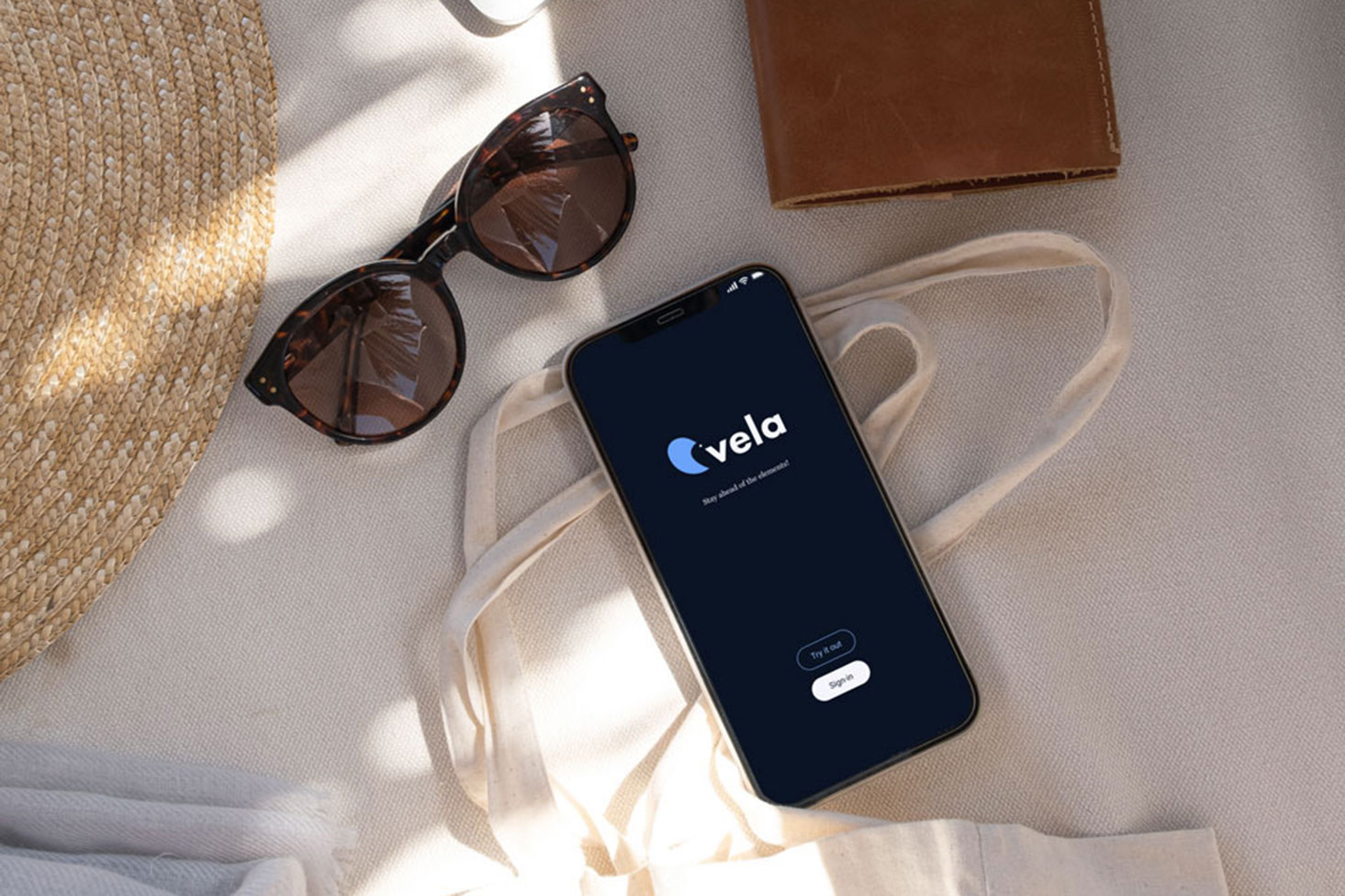
Loading splash screen
8. Summary
Key learnings
1. Continuously renewing the problem statement and the content of the whole project based on the various feedback, peer-reviewing and usability tests.
2. Isolating the relevant information from the usability test and creating a right hierarchy of the errors for the next improvements.
3. How to integrate and benefit from rapid sketching and wireframing to minimize the possibility of any user flow errors with the smallest costs possible.
Key challenges
1. To find a niche for a product to stand out from the current competitors.
2. To build a logical interface and intuitive connections between the three main features.
3. To find the balance between the amount of text and visuals – that instructions wouldnt become too overwhelming.
Conclusion
My key takeaway is that when working from end-to-end design, then always try to connect with the users themselves. These small tweaks and interactions, which were based on user insights, will set Vela apart from the rest of the competitors. For example, having a dark-themed design, creating a possibility to pin their location for their friends, or having a community page, where they could offer tours as a service for beginners or foreign sports enthusiasts – these are just small choices I encountered during the process while designing the application.
With Vela the following steps would be to finish all of the user flows at the sitemap and find any user flow errors through another usability test. Also to revise the spacing and the hierarchy of the visual elements to polish the final design.

